Ticklists App
Product Designer
Developer
Marketer
Live at Ticklists.app. Find out who it's for and how it works at Ticklists.com.
Impact
Since launch, running my own household's weekly shop through Ticklists has cut planning time from 30 minutes to 5, an 83% reduction, and cut time spent shopping in-store by 20% on average.
The problem
I ran our household food shop from a shared Google spreadsheet for years, because every dedicated list app I tried was worse. None of them solved the one thing that actually mattered: putting the list in the same order as the store I was walking round. Every list came out in whatever order I'd typed the items in, so I was walking back and forth across the same aisles every week, and retyping the same items every time because nothing was ever saved.
Ticklists solves this with sections that can be dragged into any order, per store. Set the order once for a store's layout, and every list for that store comes out sorted to match it from then on, whichever household member is doing the shop.
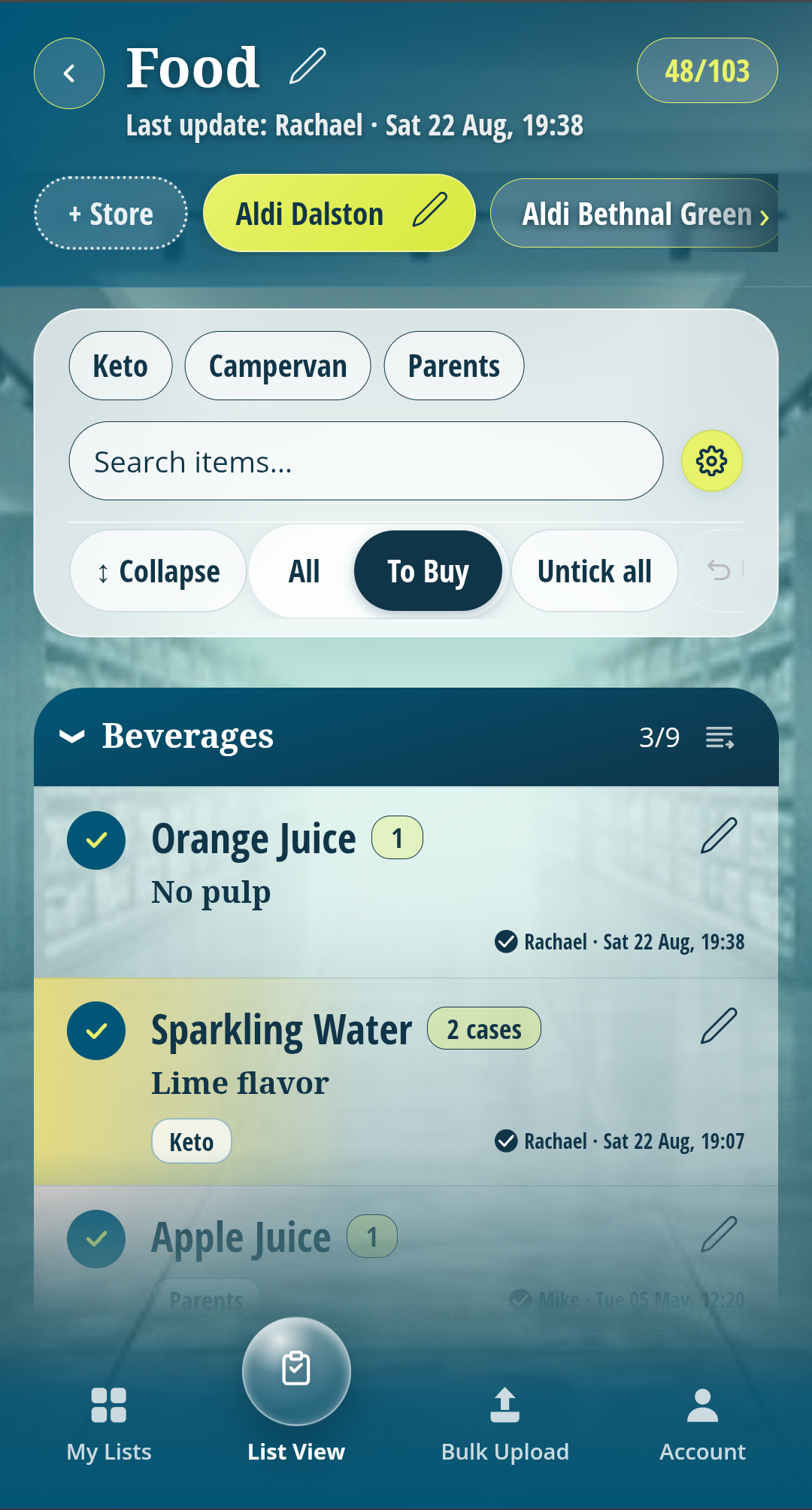
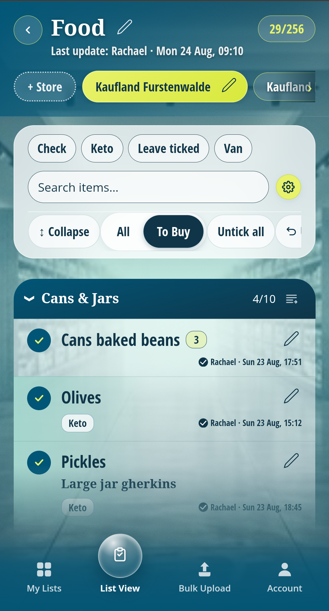
The same Food list, sorted differently for two different stores, Aldi Dalston on the left and Kaufland Fuerstenwalde on the right. Switch store and the list re-sorts to match that store's aisle layout, nothing retyped.
.
Design Talkthrough
Product Walkthrough
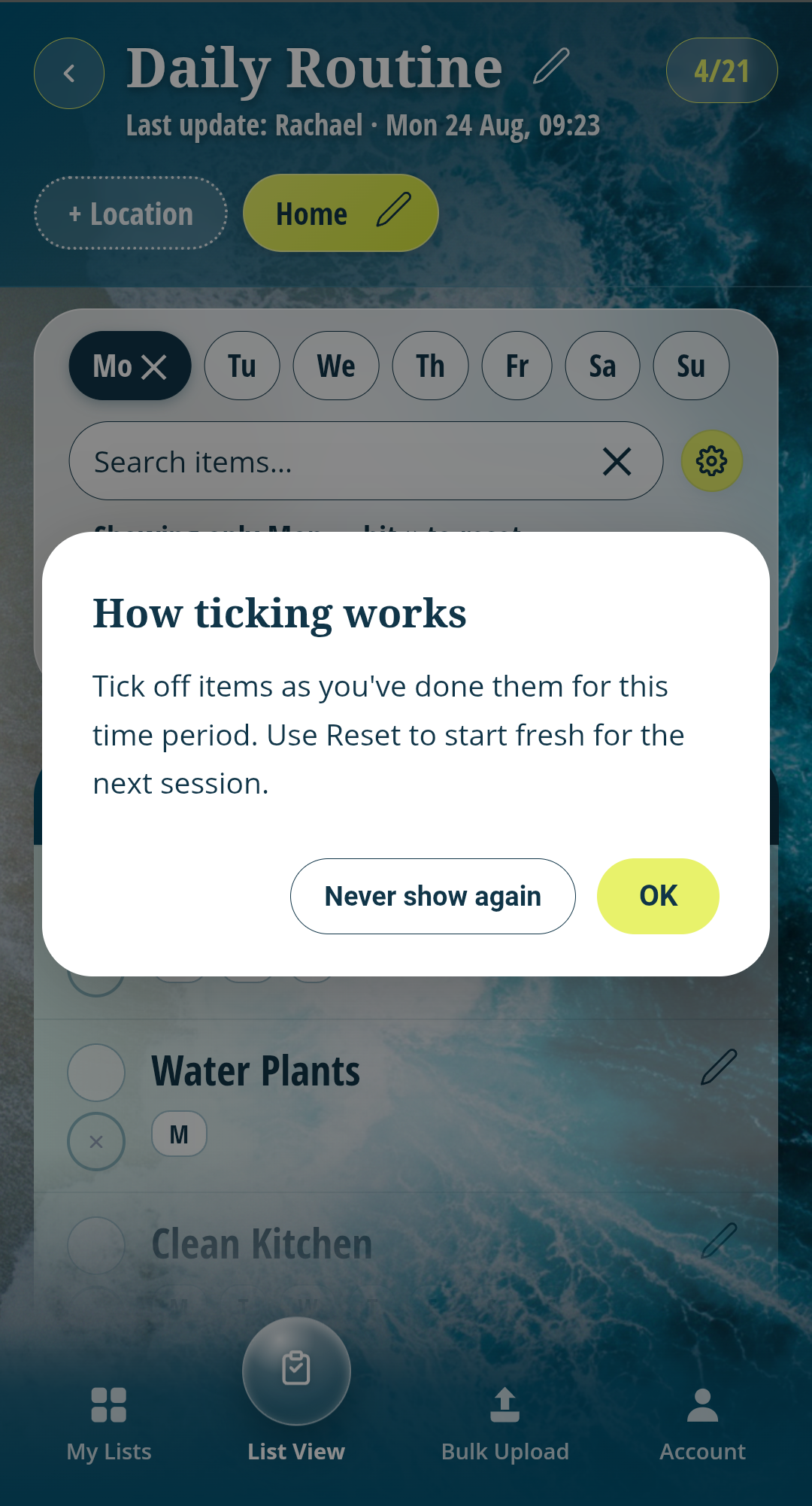
Most list apps delete or move an item the moment it's ticked, so the whole list has to be rebuilt from scratch next time. Ticklists keeps every item on the list instead (until it's deleted). On a shopping list, you tick an item as it runs out and would be needed in the next shopping trip, then filter to "Ticked only" whilst in the shop, and untick as things are bought, or tap "Untick all" once everything's unpacked at home. On a routine, it works the other way round: tick a task off as you complete it, then reset the list for the next day. Either way, nothing gets retyped.
Signing up
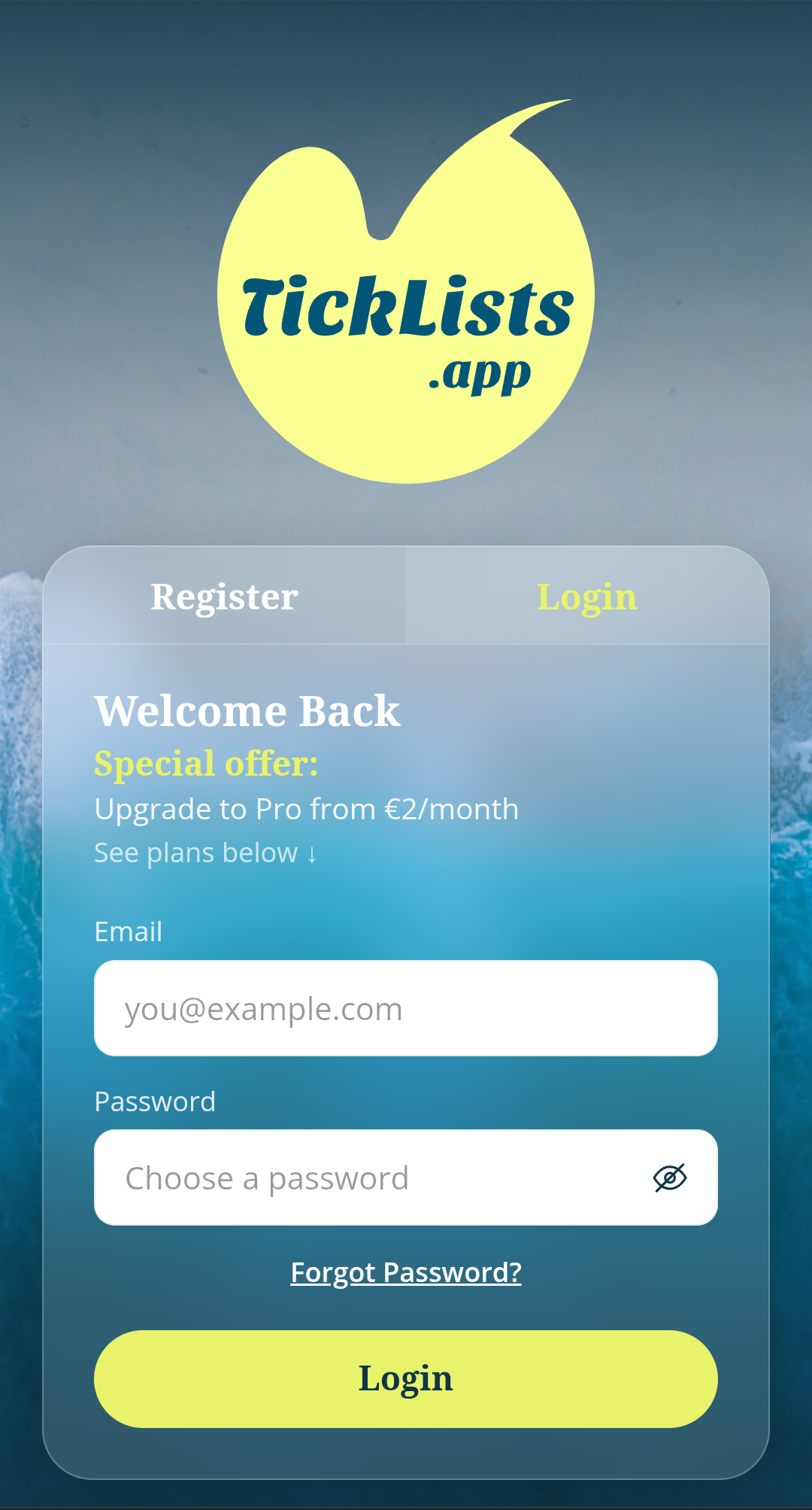
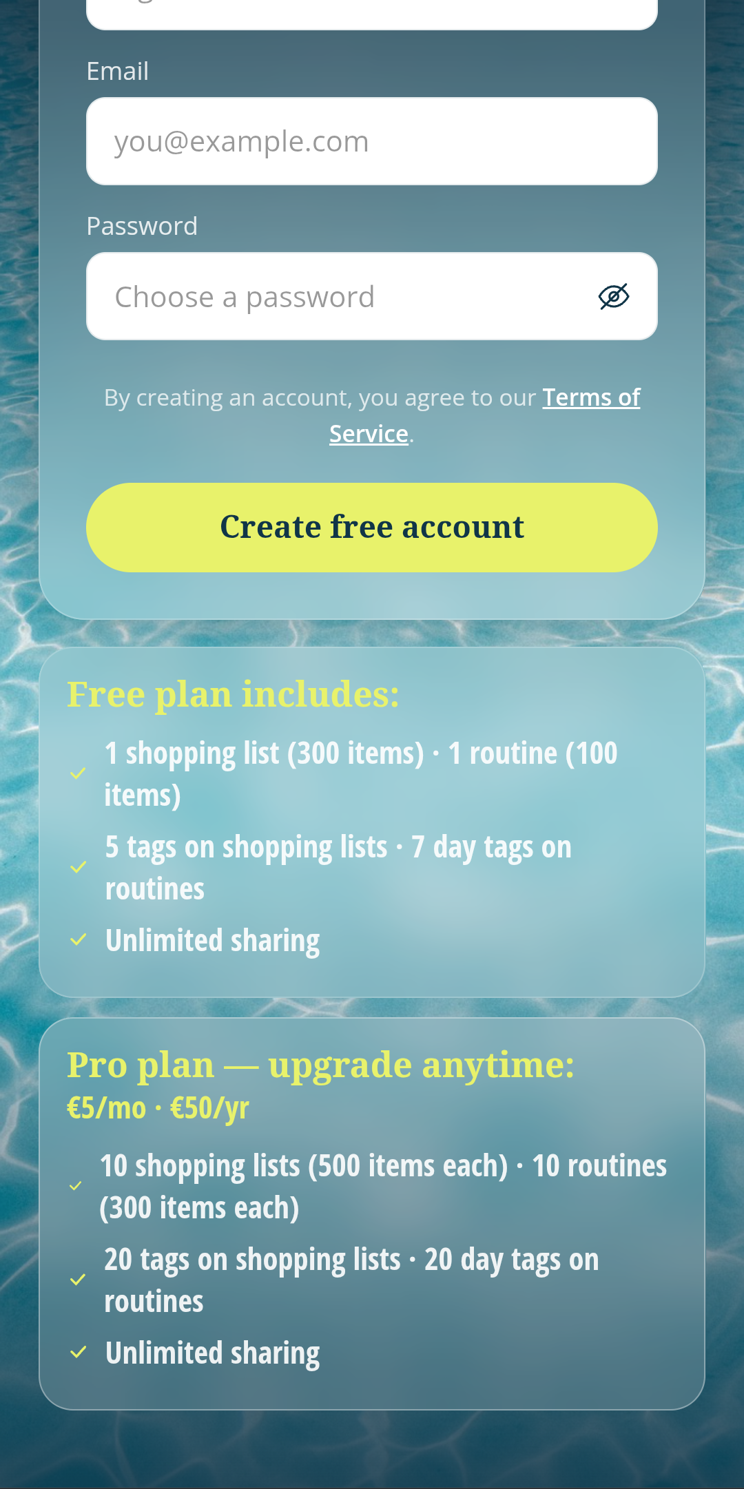
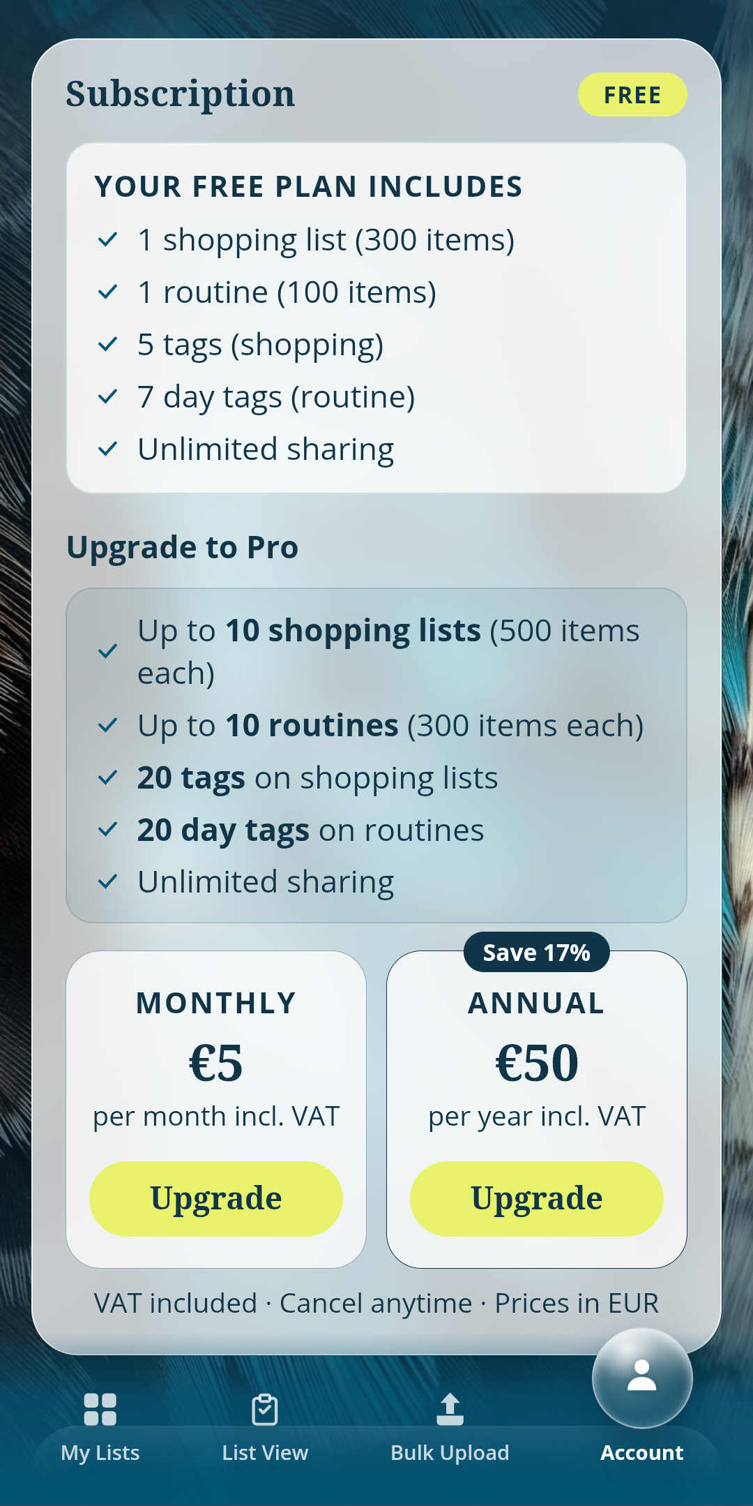
Free and Pro limits are shown before signup, not hidden behind a paywall.
Shopping lists that sort themselves
A Master List gets bulk-pasted in once, with sections if wanted, then shared with named household members by email. From there, everyone just ticks food off as it runs out, so the person doing the shop can filter to "Ticked only" and see exactly what's needed, in the right order for whichever store they're walking round.
Routines run on the same engine
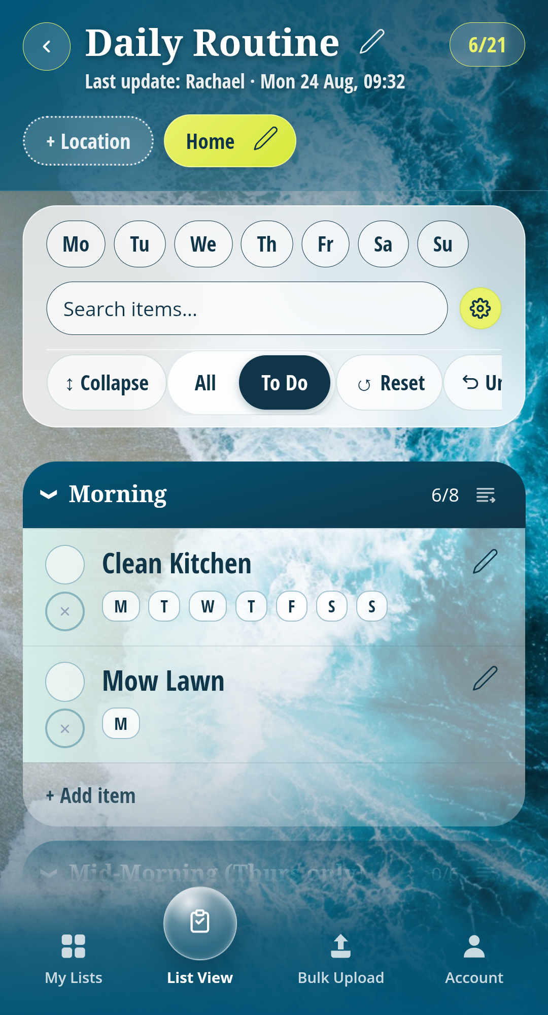
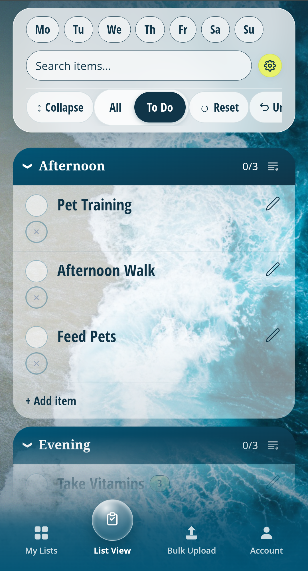
Routines use the same ticking and sections, but read differently day to day. Set up the regular tasks once, tick them off as they're done, and filter to see only what's outstanding for today. Reset at the end of the day and the list is ready to go again tomorrow, nothing rebuilt.
My Lists, made to feel like yours
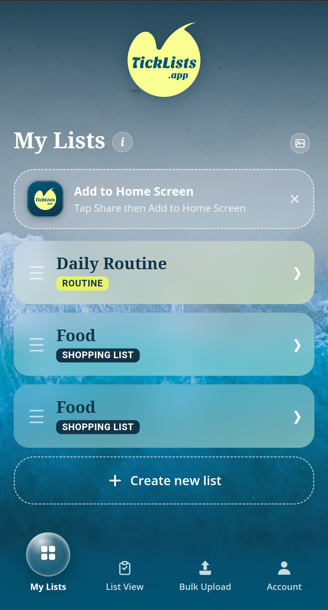
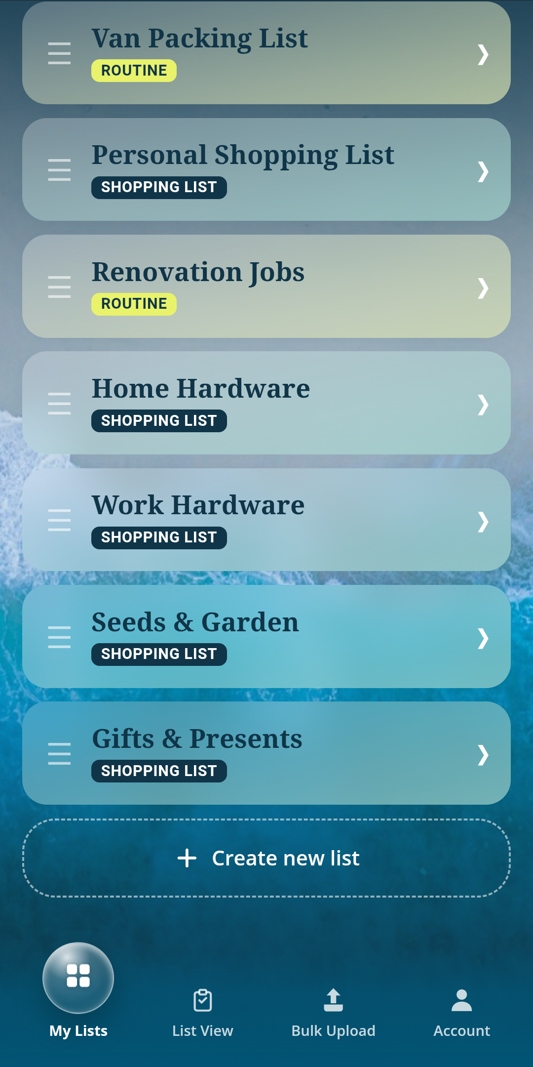
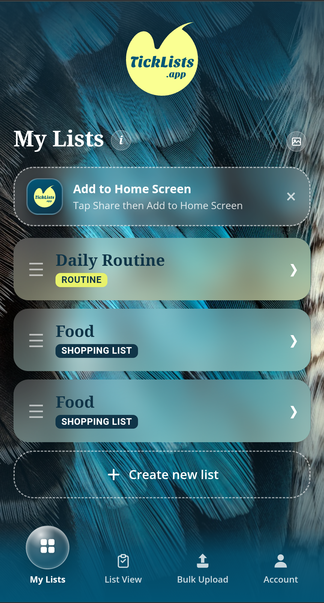
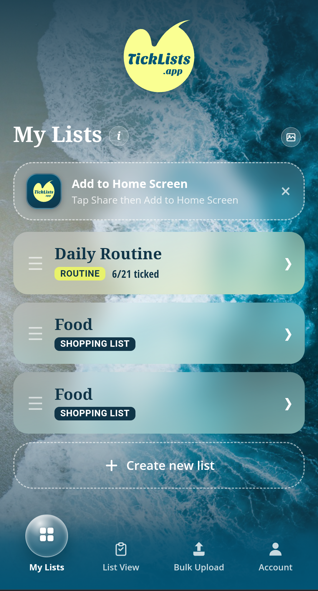
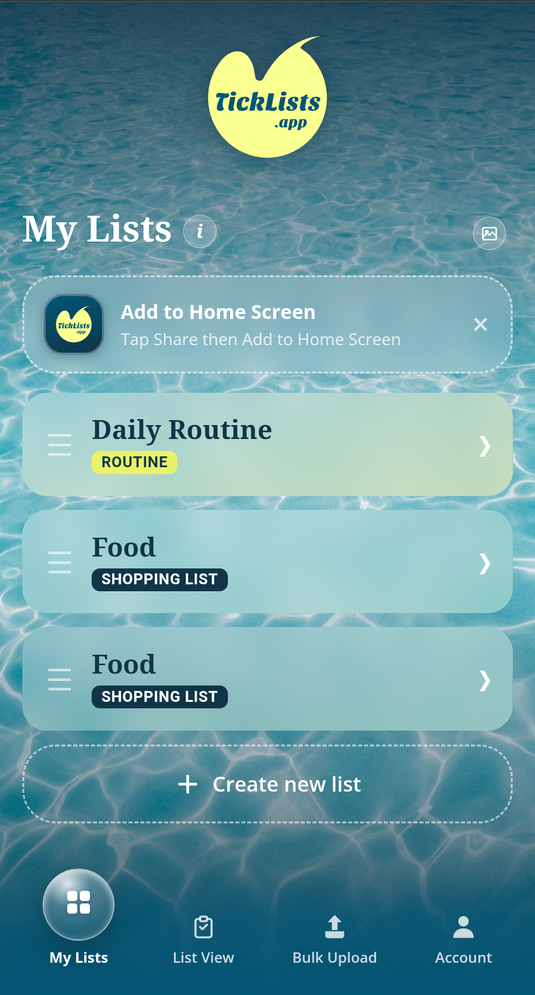
Every shopping list and routine lives on one home screen, reorderable by drag, with a one-tap "Add to Home Screen" prompt so the whole thing installs like a native app without an App Store.
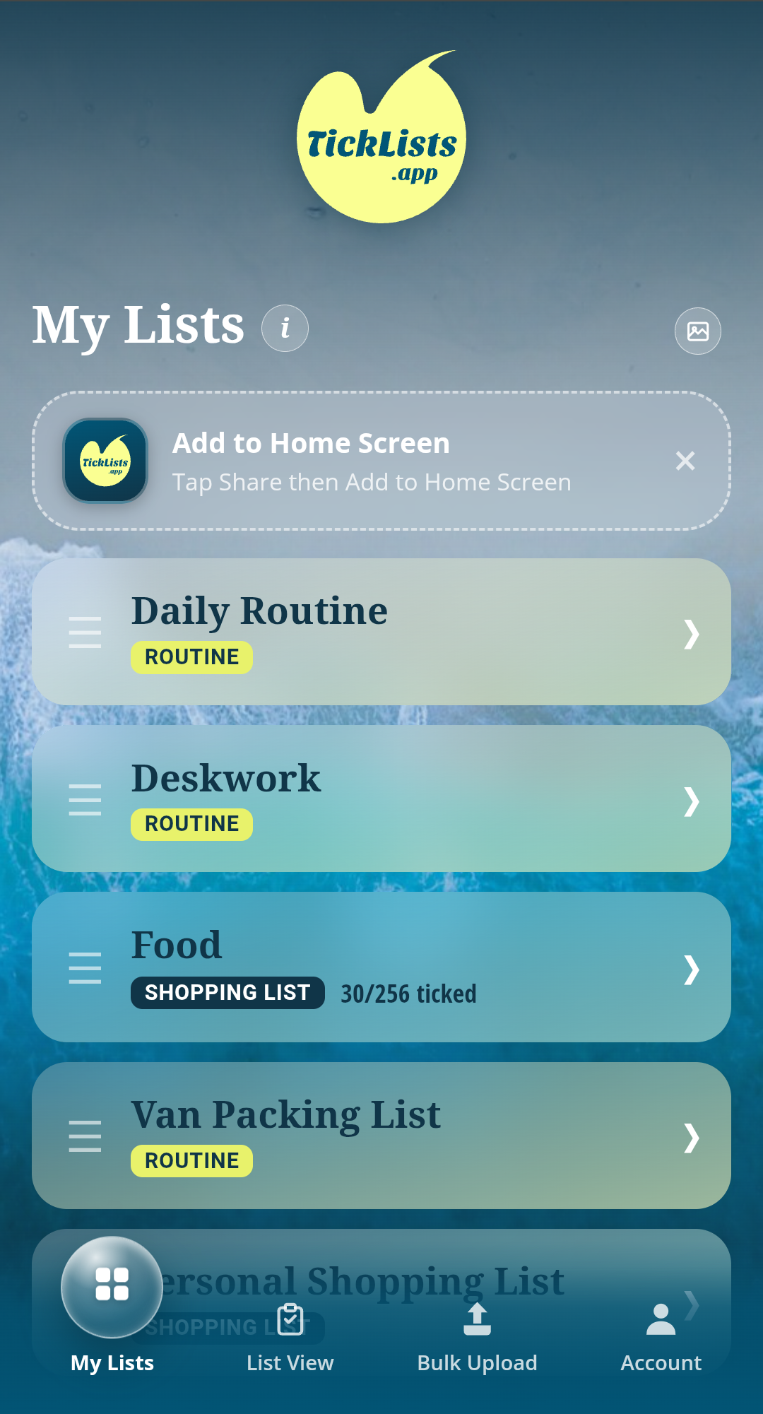
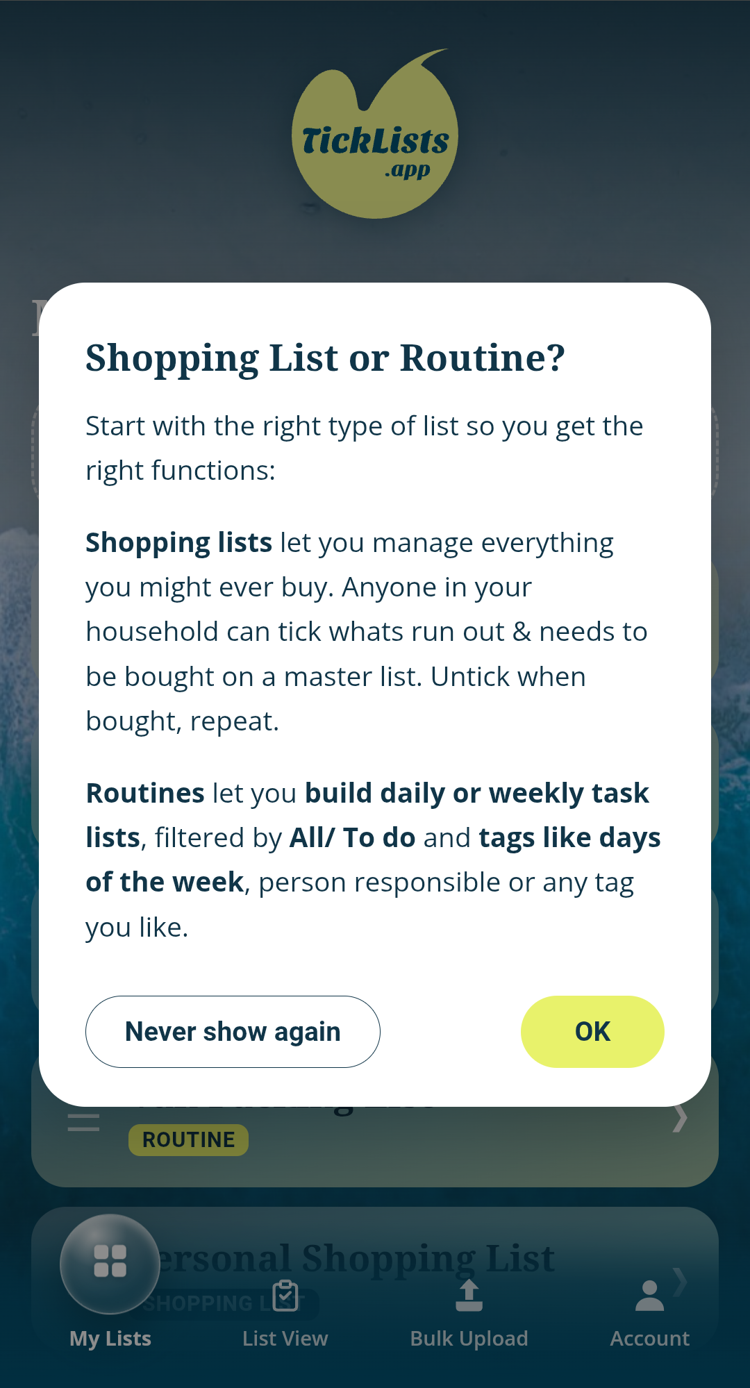
Each list can also carry its own backdrop, a small touch that makes a shared list feel like it belongs to whoever's using it, not a generic system screen.
Account, plans and sharing
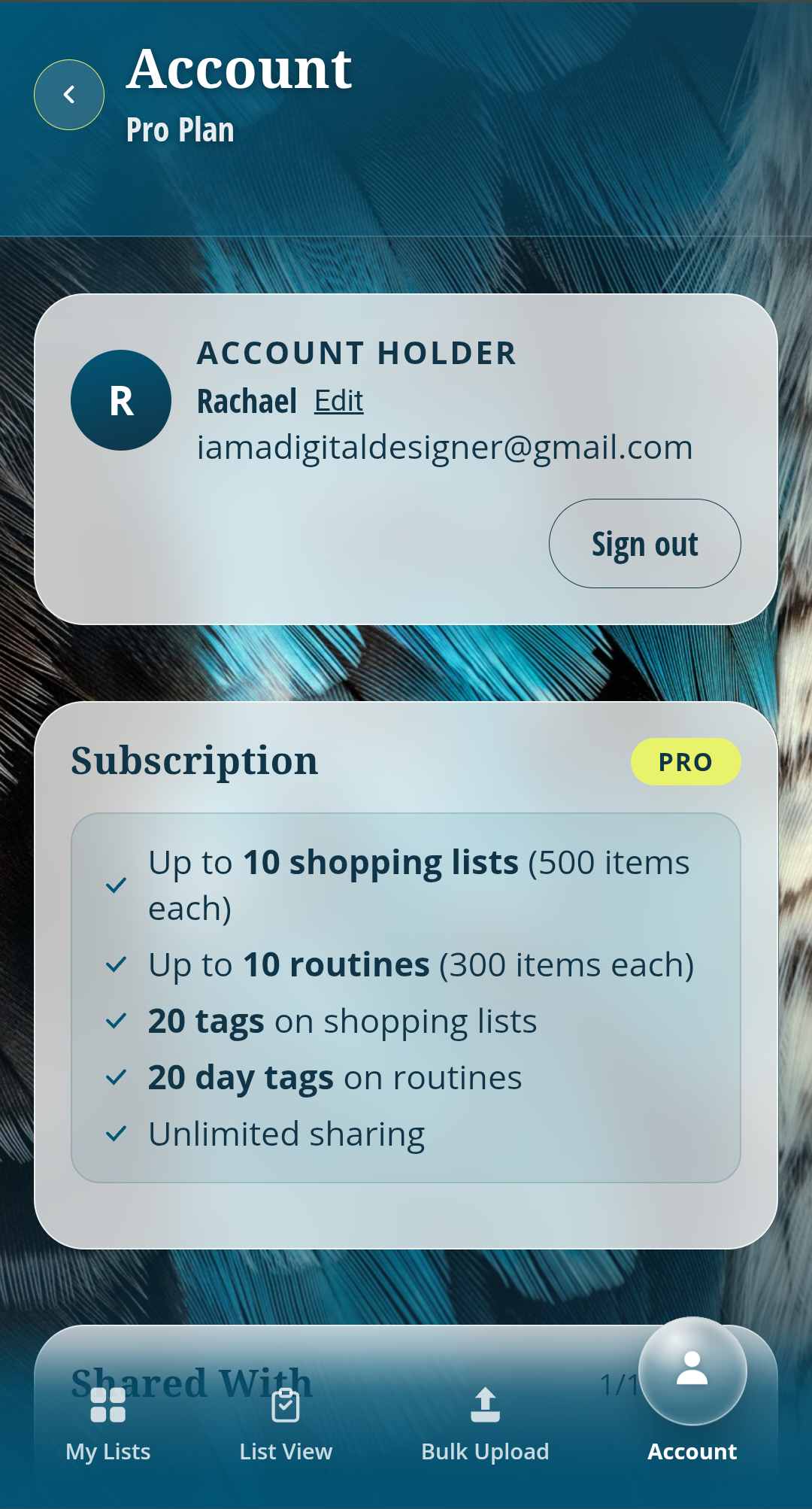
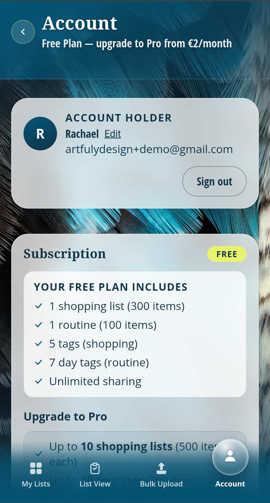
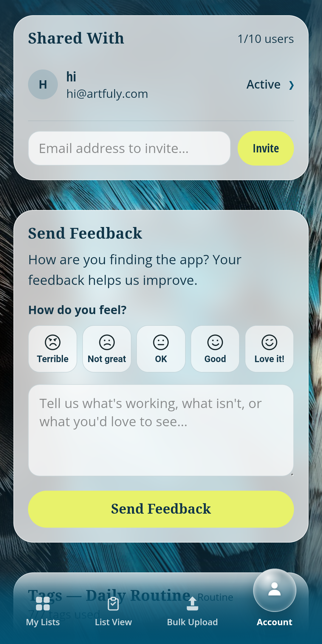
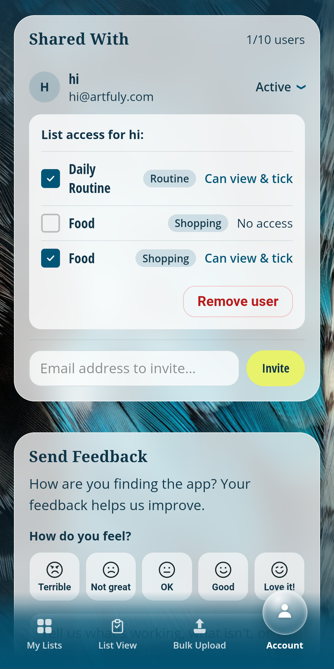
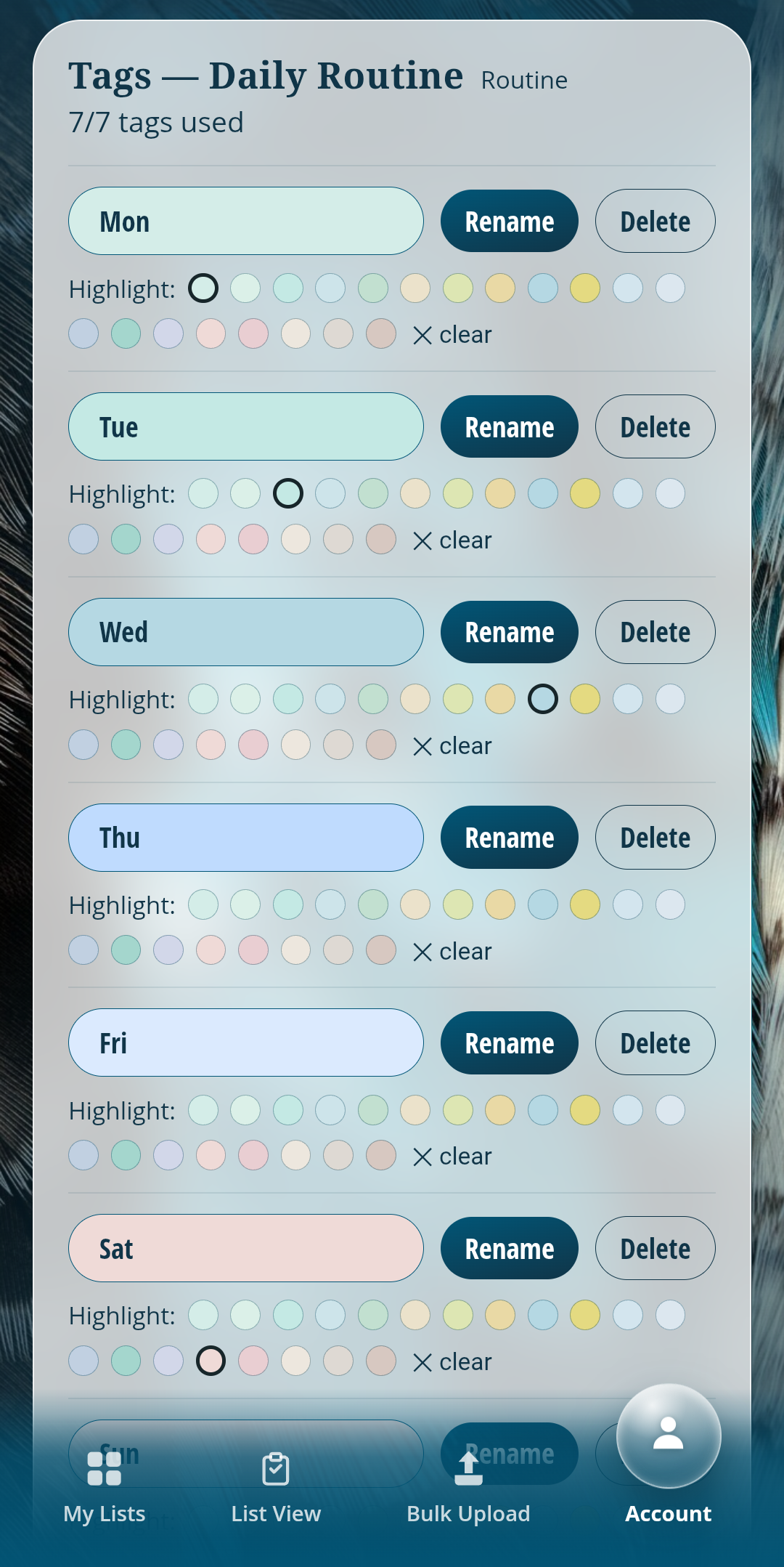
One screen covers the account holder's details, current plan, tag management, and exactly which household members each list is shared with.
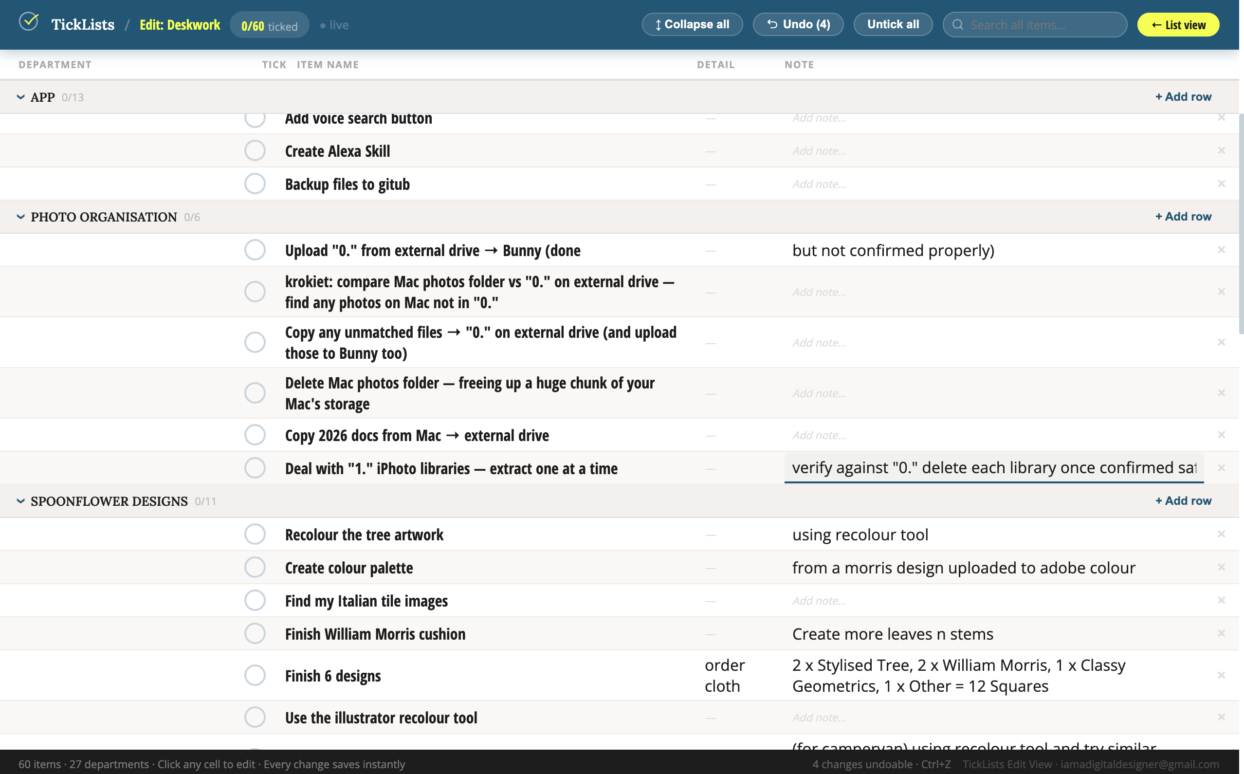
Desktop and tablet, spreadsheet view
Bulk-editing a big list is faster in a spreadsheet grid than tapping through one item at a time, so the same list can be opened and edited this way on desktop or tablet.
Background
Every list app I tried either made me retype the same items constantly, or had no way to group items by section at all. Google Sheets was the closest fit, because it let my household see live ticks together, but it had no search and no sections. Task apps like Asana solved the structure problem but were built for work teams, not a weekly food shop.
Competitive landscape
Nothing on the market lets a household bulk-upload a master list and have it reorder itself to match a specific store's layout. Apps like AnyList and Listonic sort by generic aisle category, but not per store, and both lose items the moment they're ticked, forcing a retype. Bring! solves live sharing well but has no master list and no store-specific ordering either.
Who it's for
- People with ADHD — a large, vocal audience whose main complaint about shopping is forgetting items; a master list that never disappears solves that directly.
- Multi-person households — everyone ticks off what's run out, live, without retyping or re-sharing.
- People running repetitive routines or property maintenance — daily or weekly tasks that need to survive from one day to the next without being rebuilt.
- Small businesses with recurring checklists — shared operational lists, such as opening and closing routines or equipment maintenance, that stay the same week to week.
Design Process
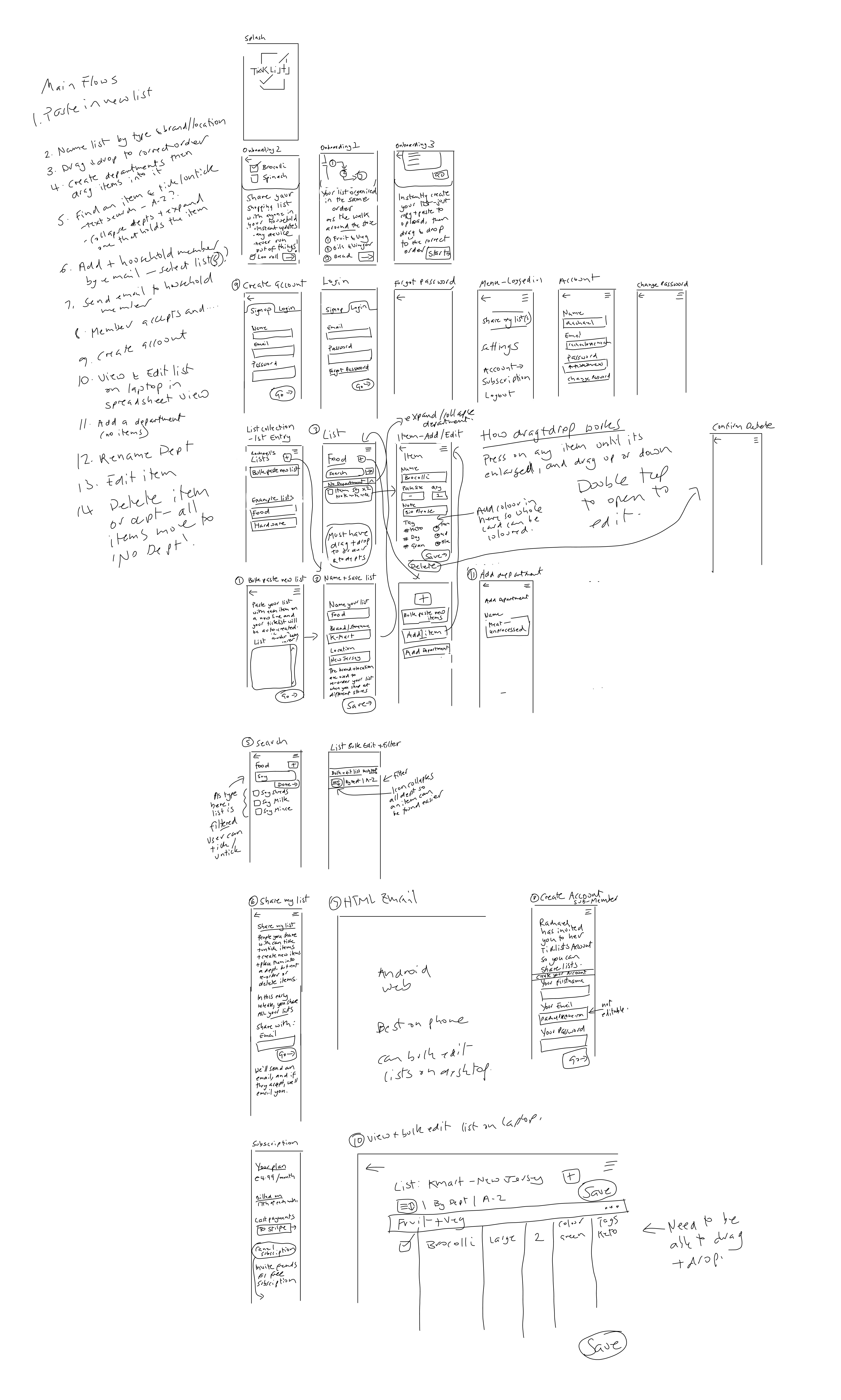
Early wireframes
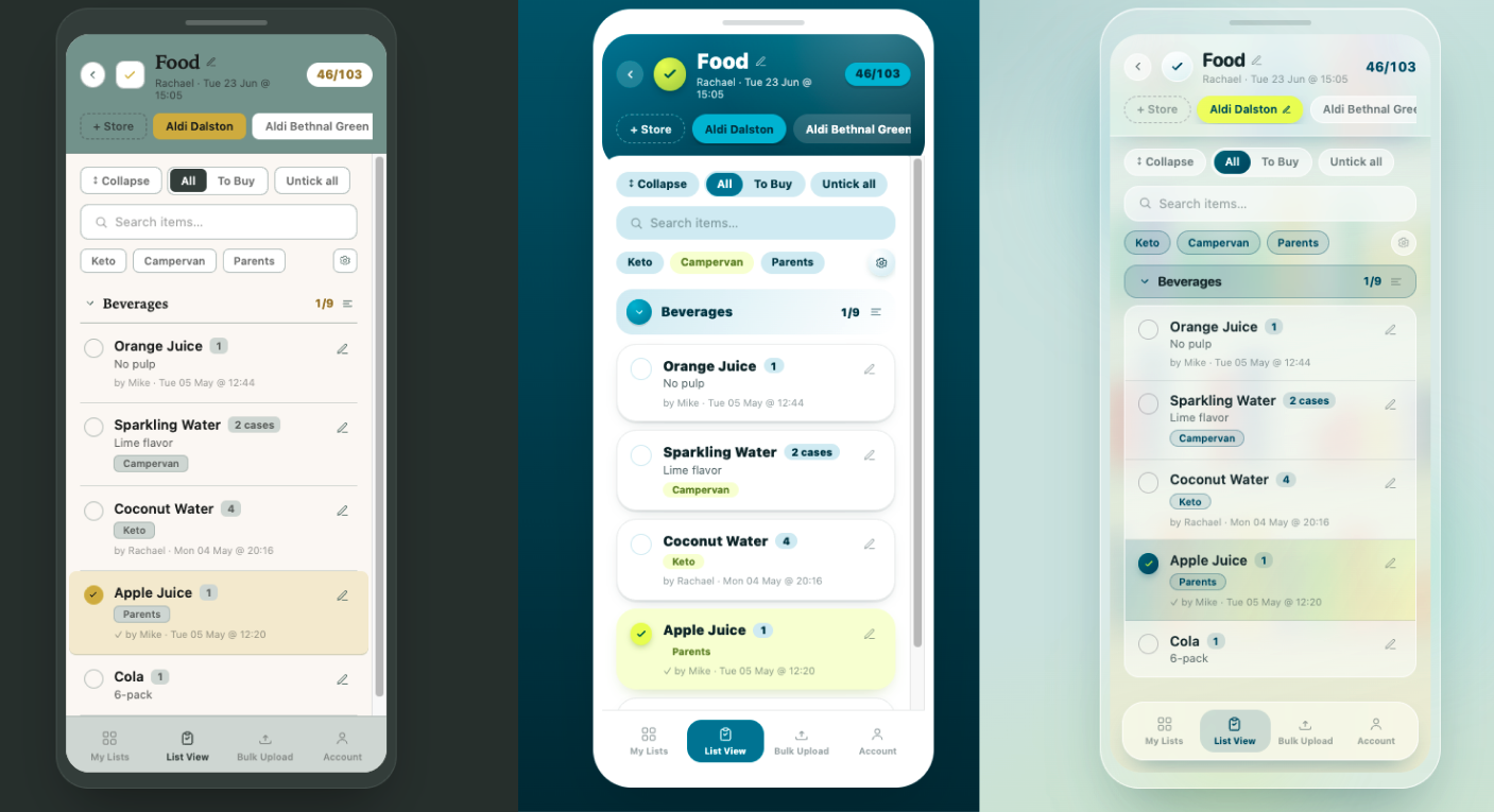
Visual direction exploration
Before settling on the current interface, I tested three directions on the same list screen: muted and earthy, flat colour, and glassmorphism. Glassmorphism won. The app is functional and text-heavy, with little room left for imagery once the UI is on screen, so I wanted a full-screen background photo to stay visible behind the interface rather than being pushed out by it, and the glass effect reads as more modern, which matched where I wanted the brand to sit.
Brand Guidelines
I used Claude Cowork to quickly create these brand guidelines. They're far from perfect, but it creates a solid base to polish from later, and keeps things consistent for now. See them at ticklists-brand-guidelines.html