Love2Learn App
Product Designer
Developer
DELIVERABLES
Live at Love2Learn.
Impact
I briefed, designed and built the first version of Love2Learn, a full spaced-repetition revision app with a real 300-question course, in under 2 hours. Inside 10 hours total, I'd also created the app's branding and business name from scratch and added a second course to the same platform.
The problem
My partner did an inland sailing course this summer in German, and I did a windsurfing course in English. He needed to revise 300 real multiple-choice questions from an official German sailing exam, and we both found there was a real disconnect between what was covered in our courses and what we were actually expected to know in the exam.
Product Walkthrough
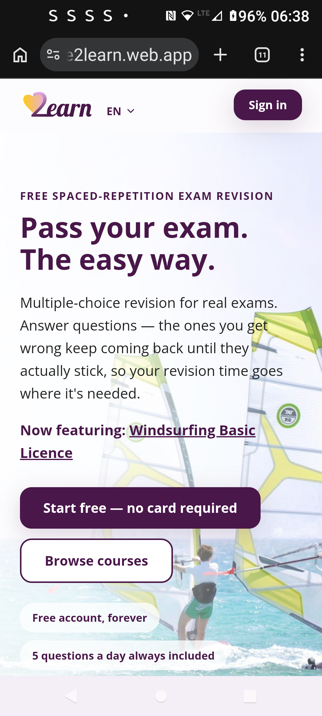
Landing page
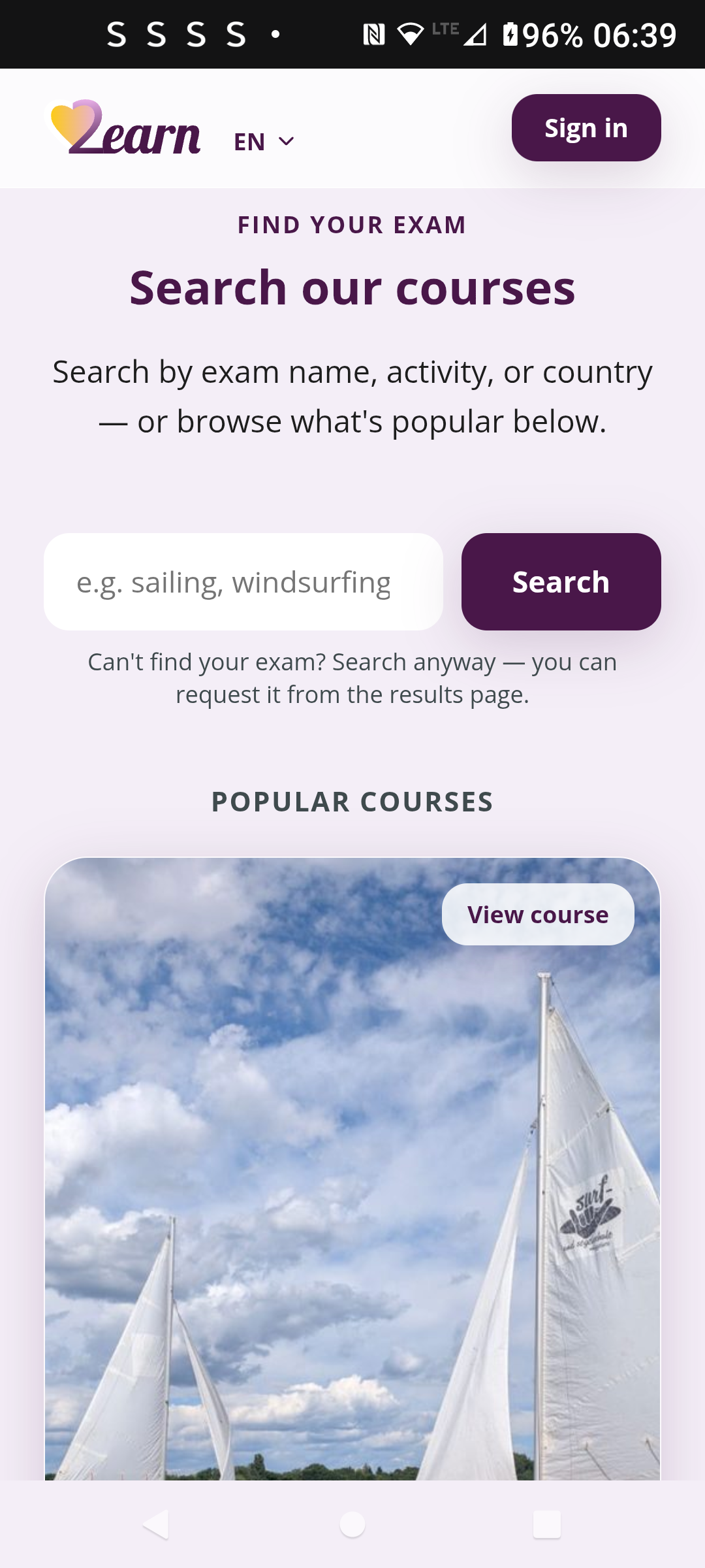
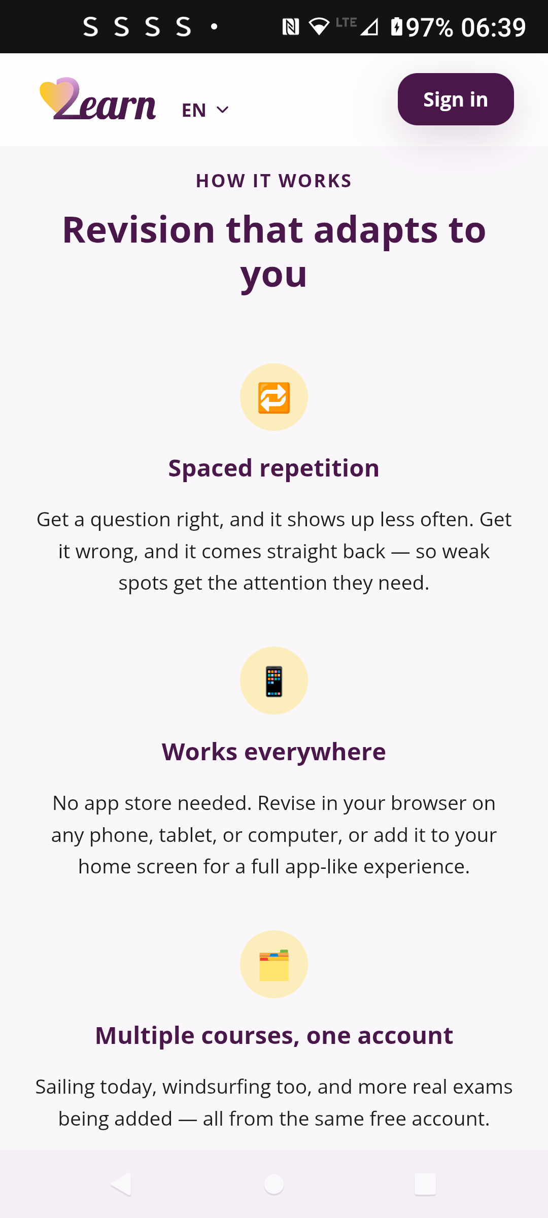
The pitch, a course search, and how the spaced-repetition model works, all live on the same page.
Signing up
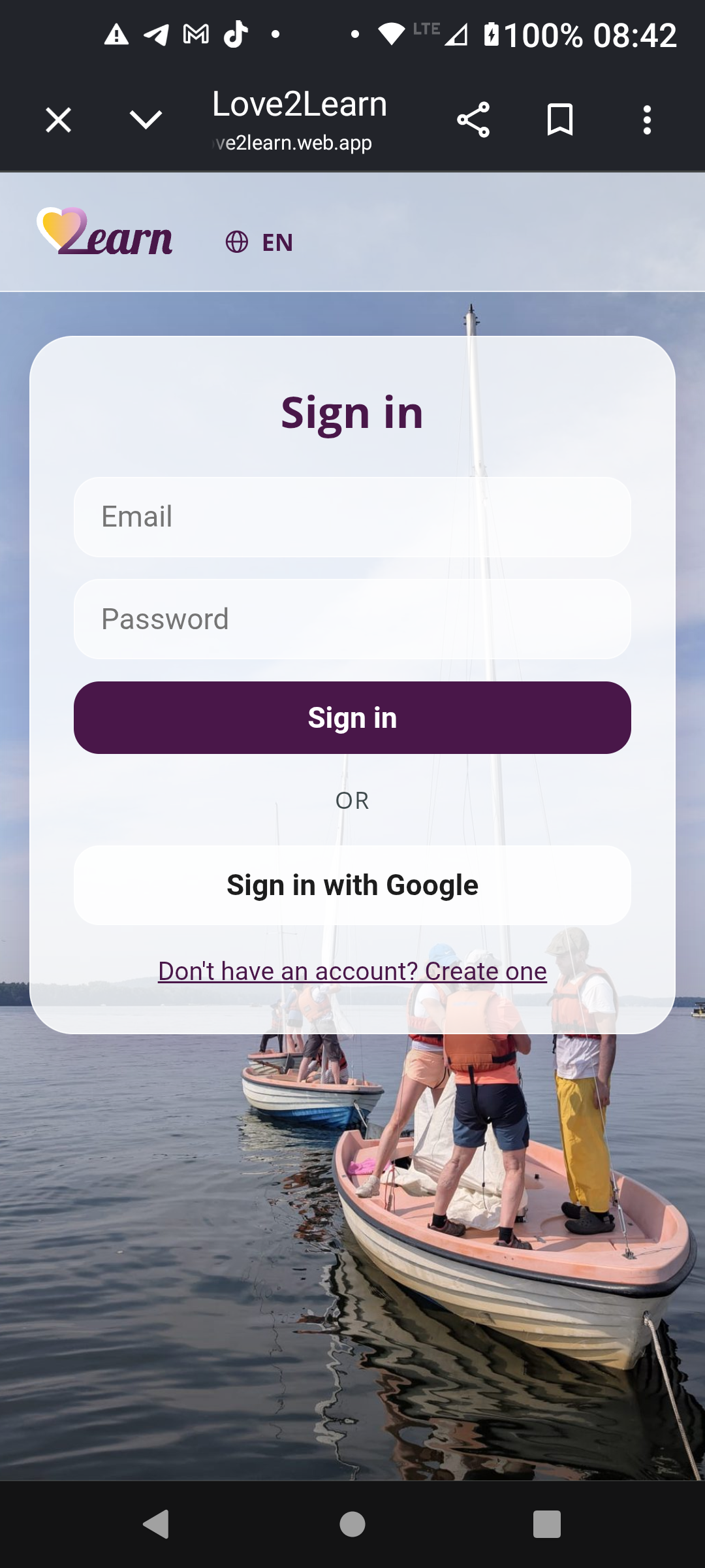
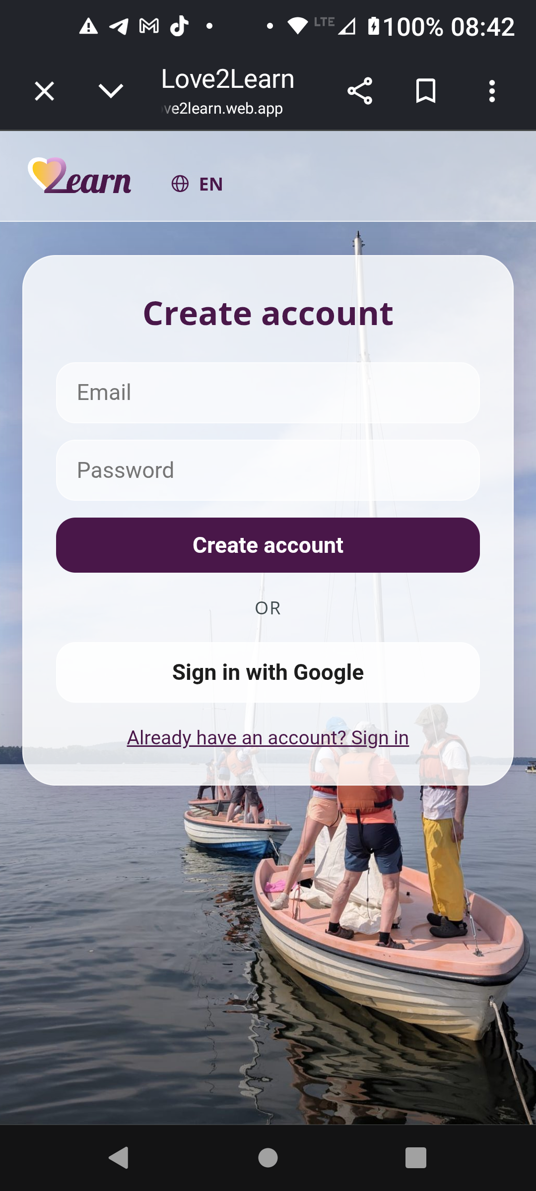
Sign in and account creation share the same card over a real sailing-course photo.
Pricing and trust
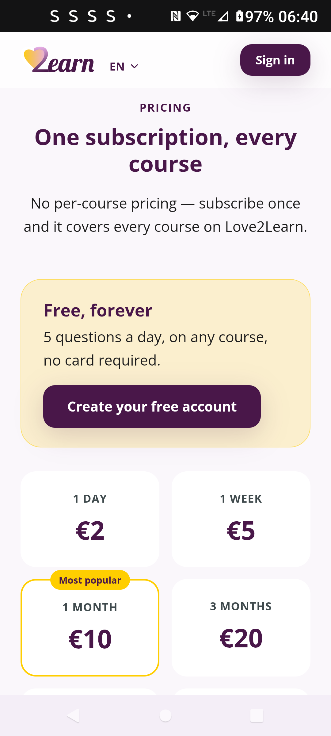
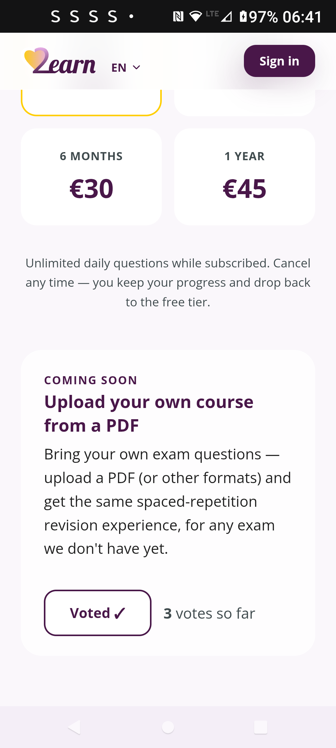
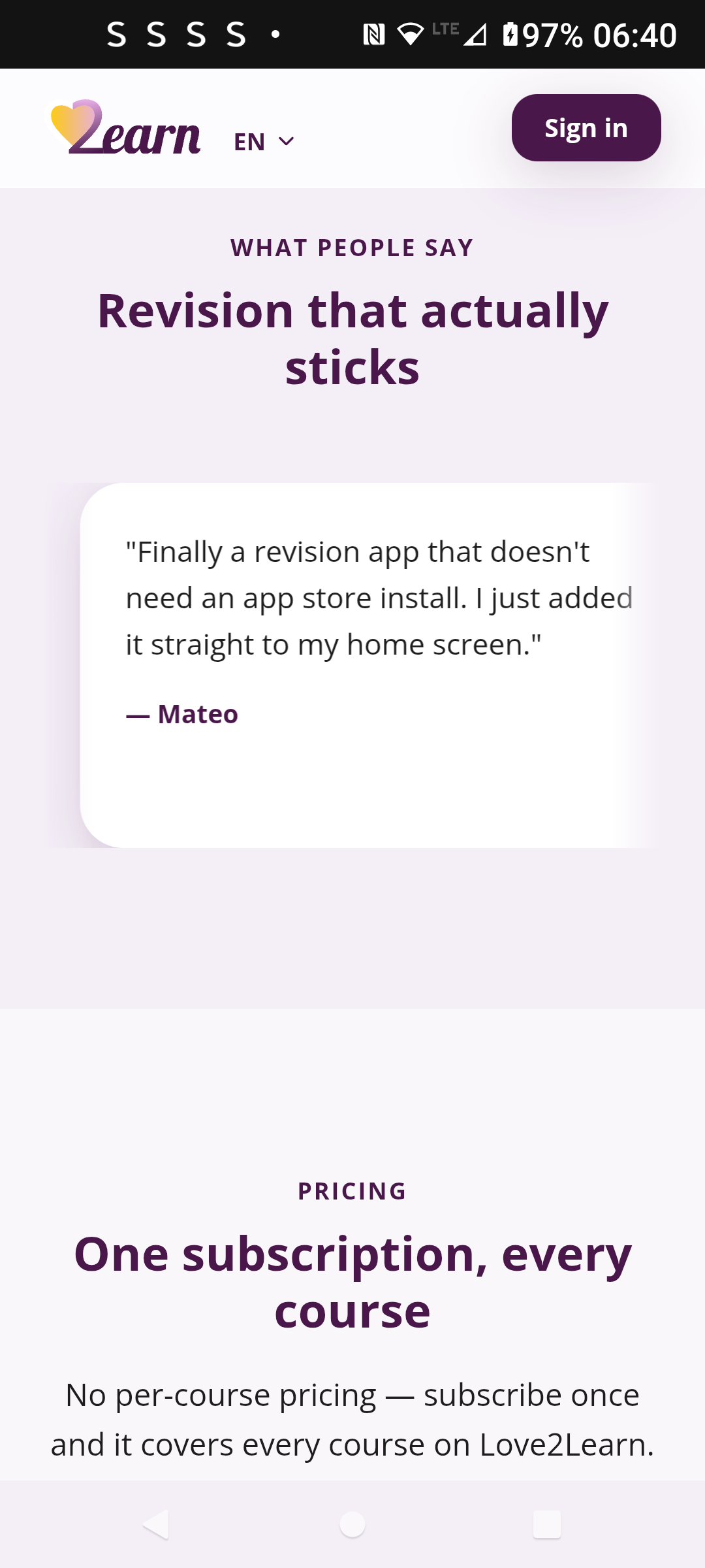
One subscription unlocks every course, and the "upload your own course" vote counter doubles as real demand validation for that roadmap item before it's built.
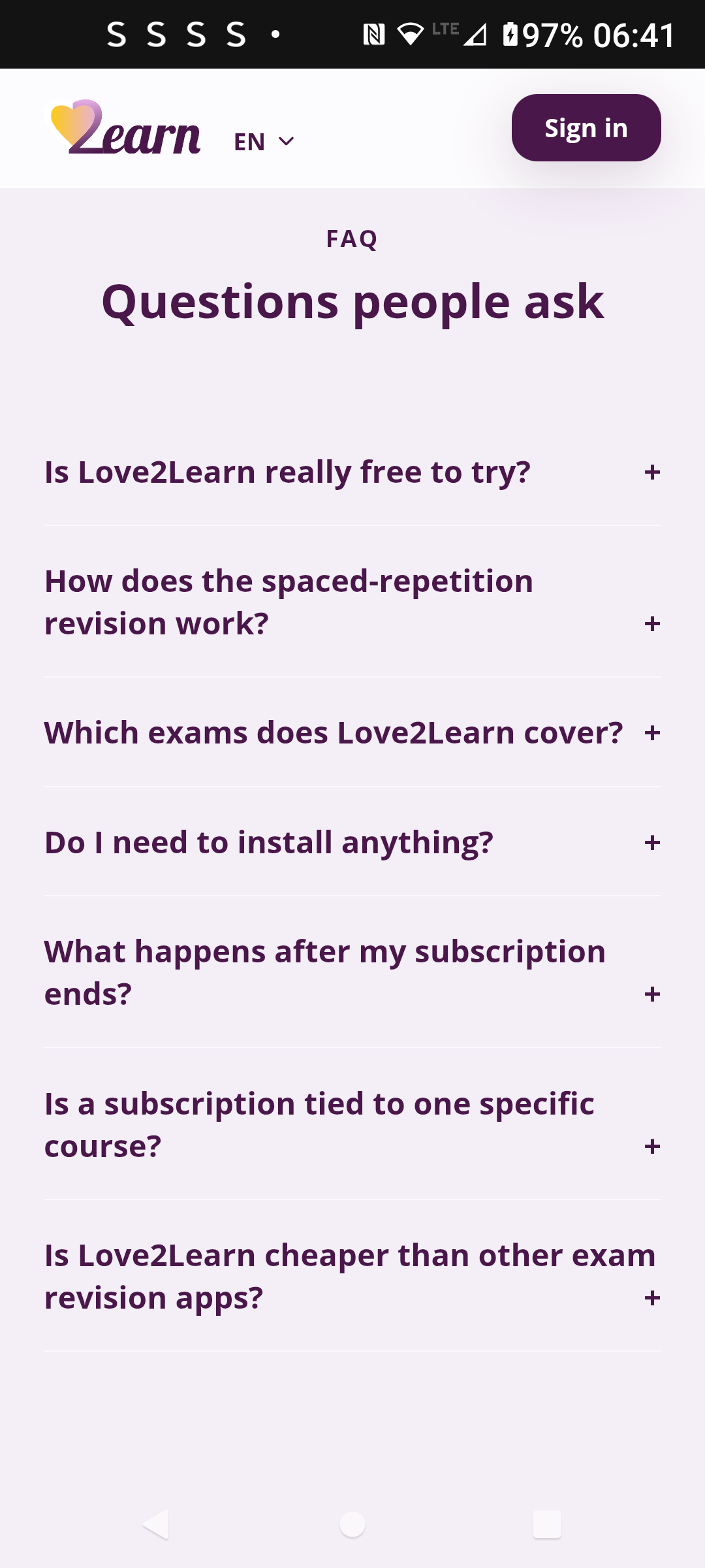
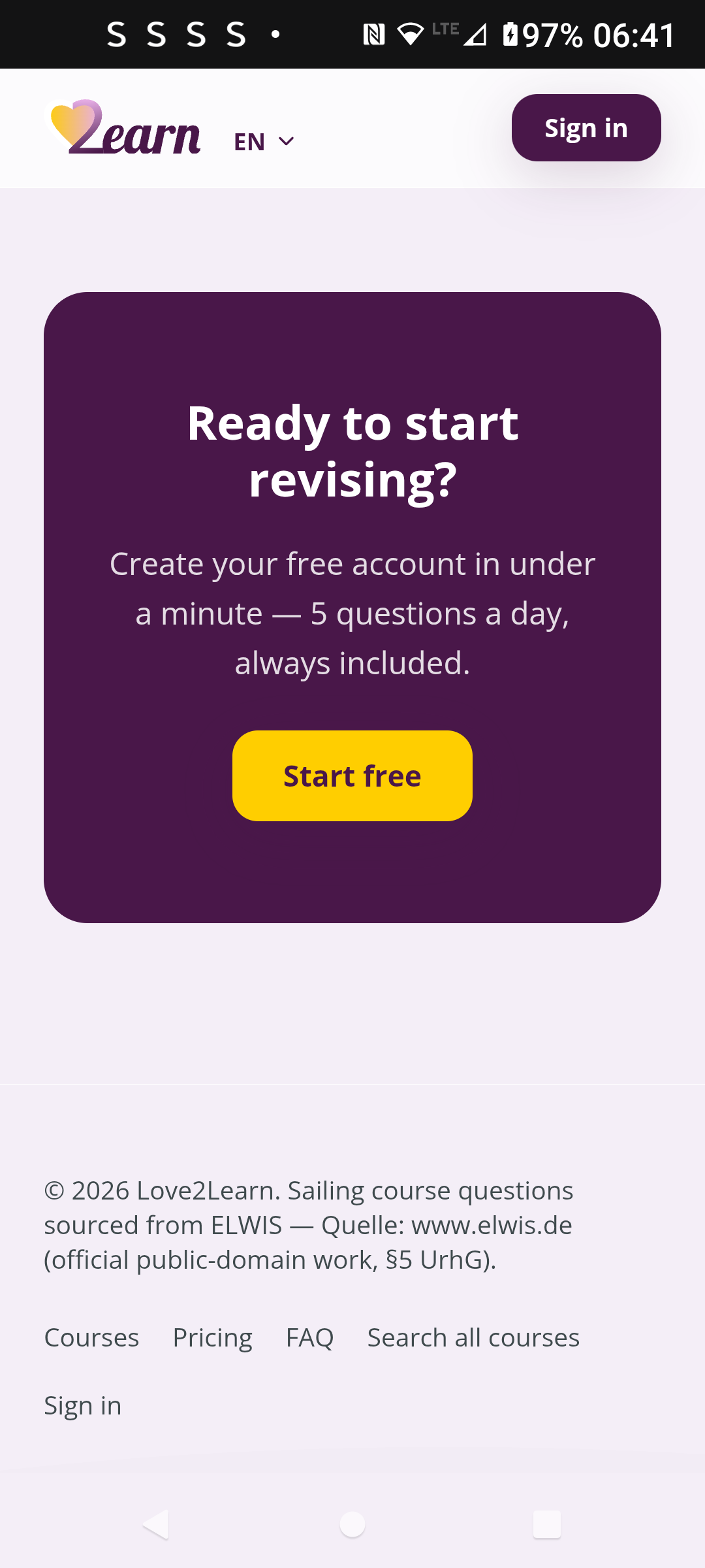
The required ELWIS source attribution sits in the footer, dark purple and gold carried all the way to the bottom of the page.
Spaced repetition in action
Get a question right and the correct option highlights in gold. Get it wrong and you see exactly which one you should have picked, styled with the same gold accent as the pricing page.
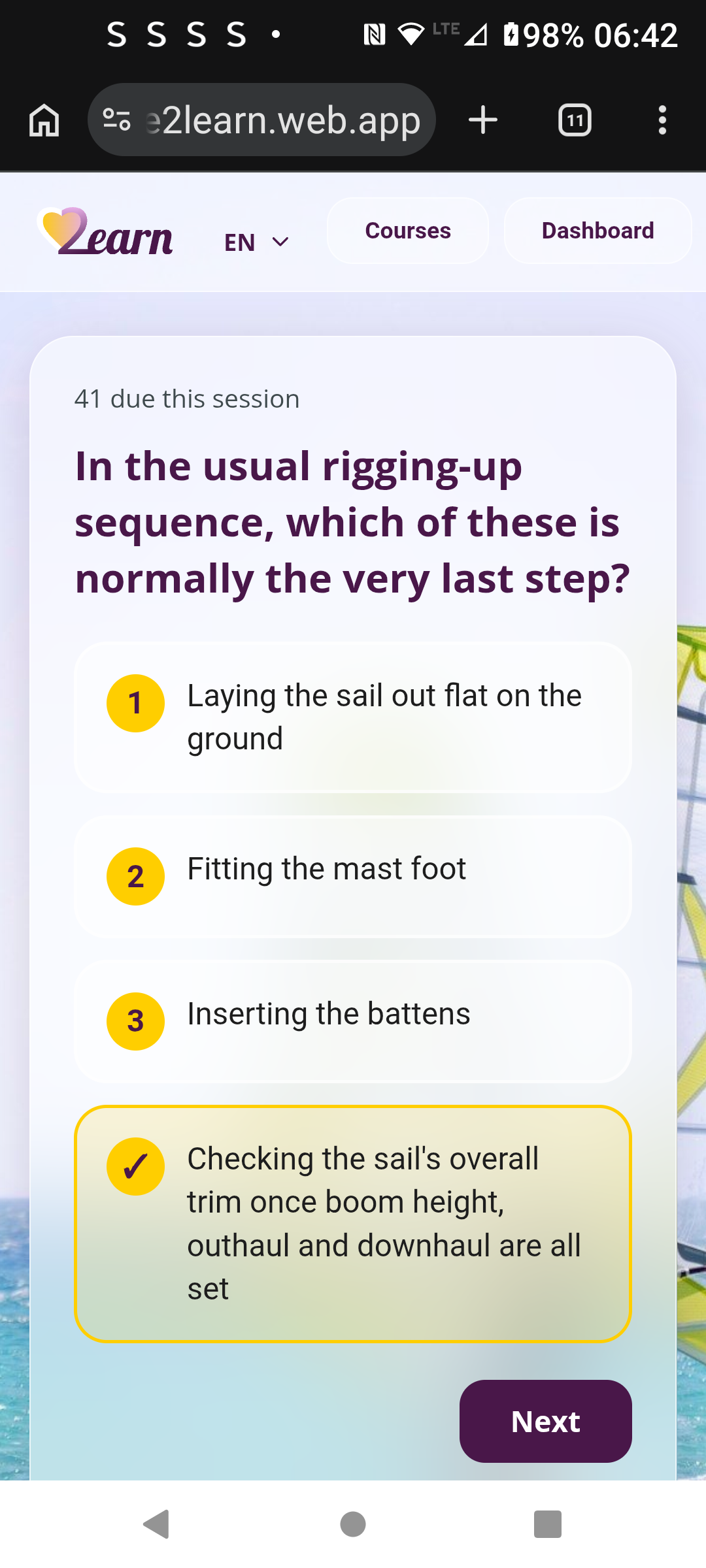
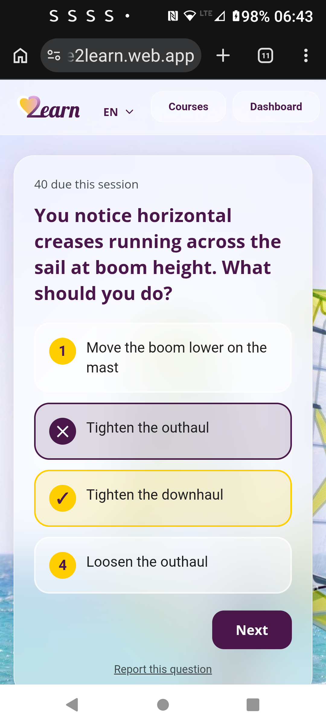
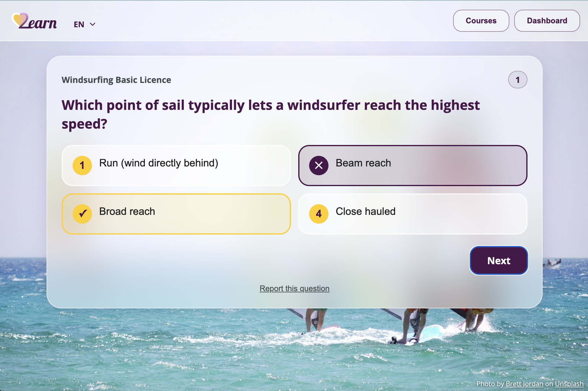
The same feedback pattern holds up on desktop, where the four options sit two-by-two instead of stacked.
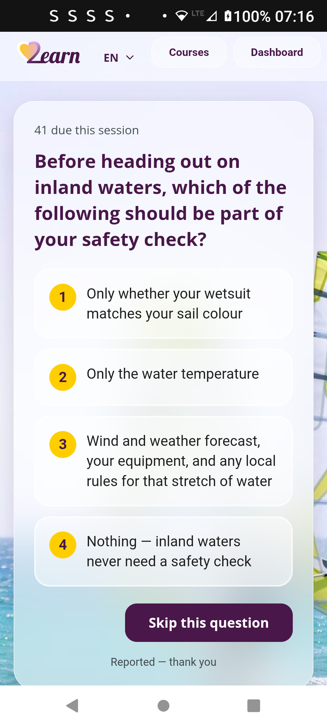
Reporting a broken question disables the options and swaps in a "Skip this question" button, so a bad question never corrupts real spaced-repetition progress.
Multiple courses, one account
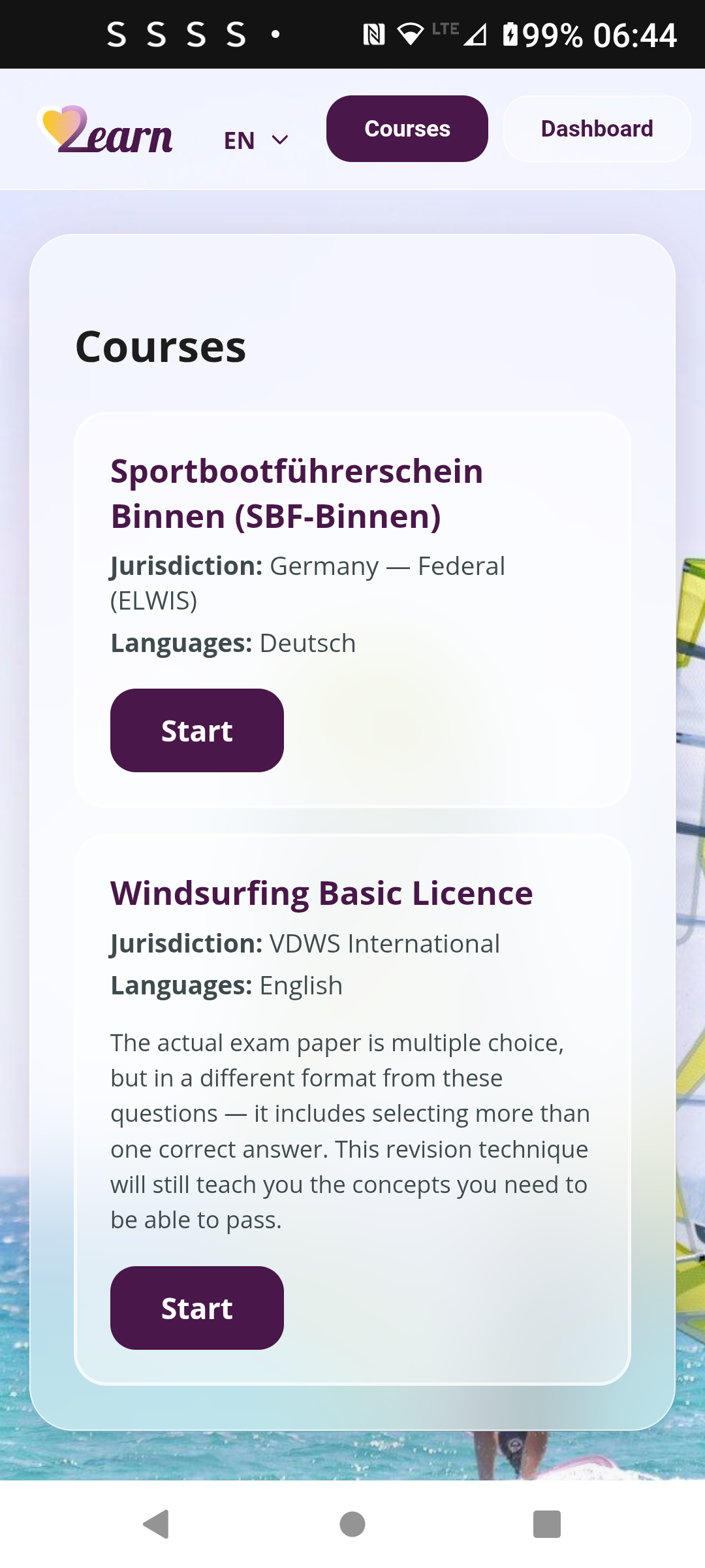
Both courses live and independently trackable from the same account.
Finding, or requesting, an exam
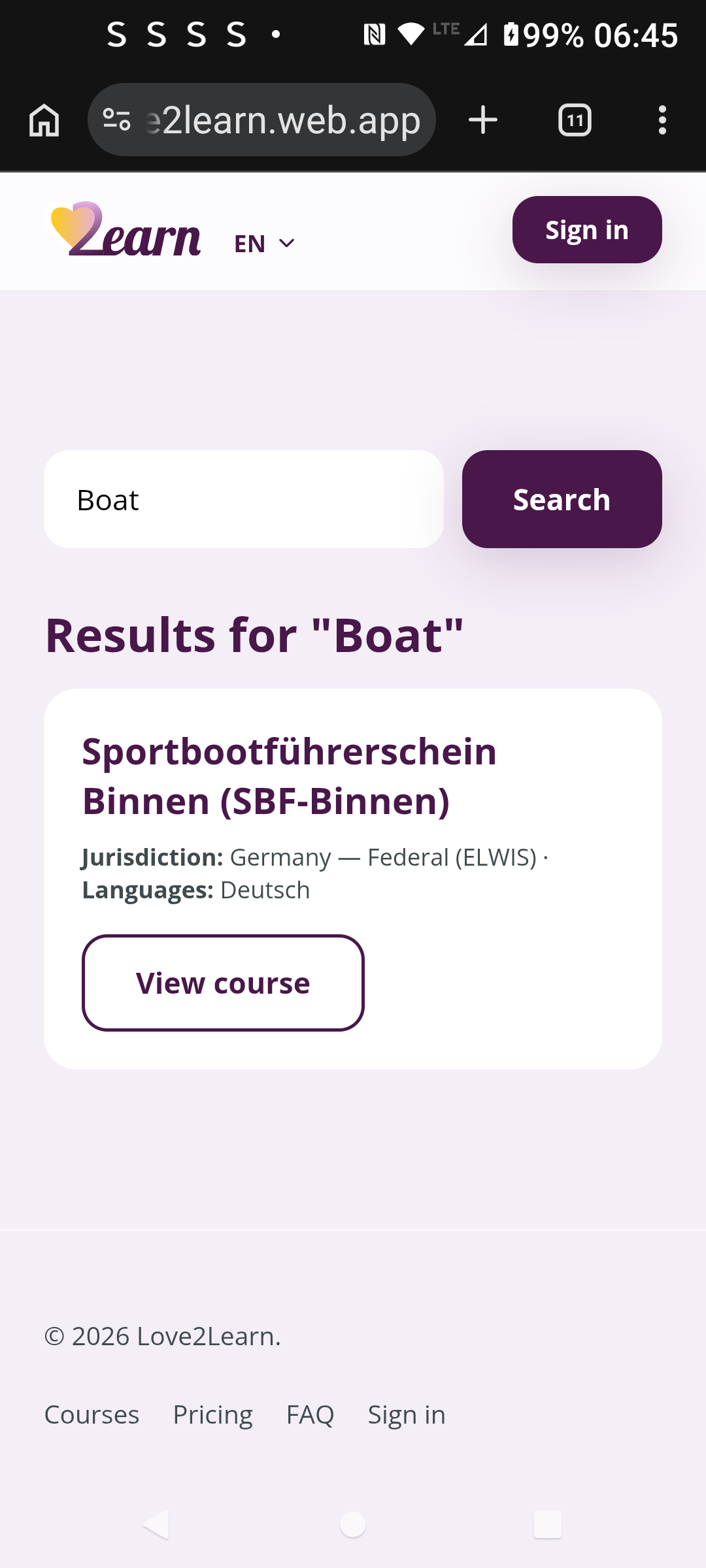
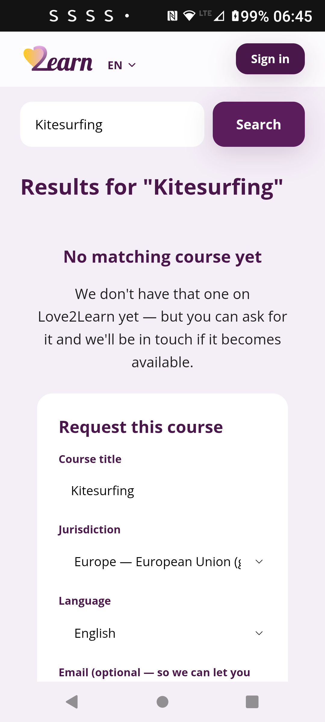
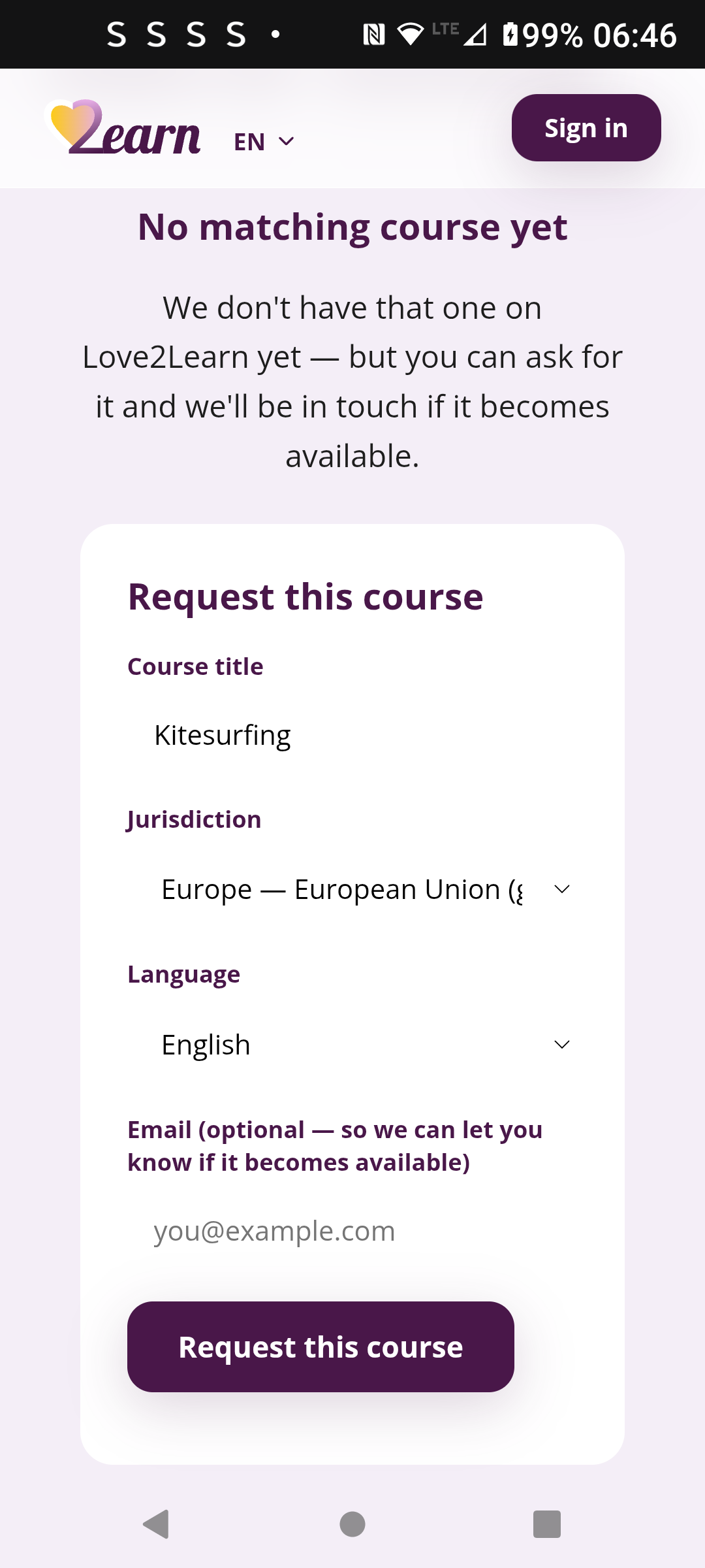
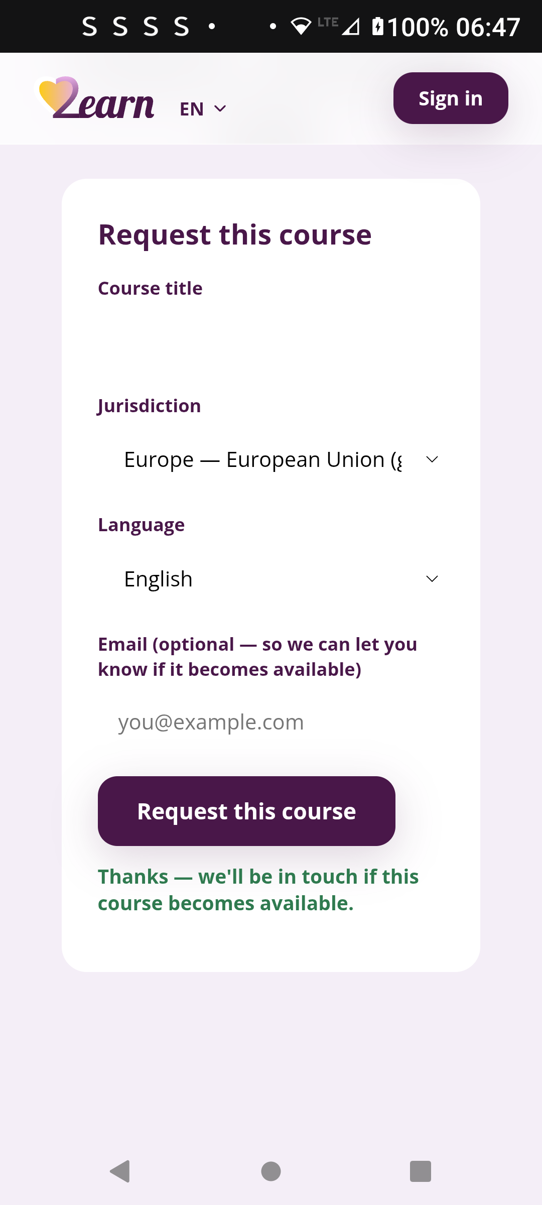
Search finds an existing course instantly. Search for one that doesn't exist yet, and instead of a dead end you get a request form.
What you're actually revising
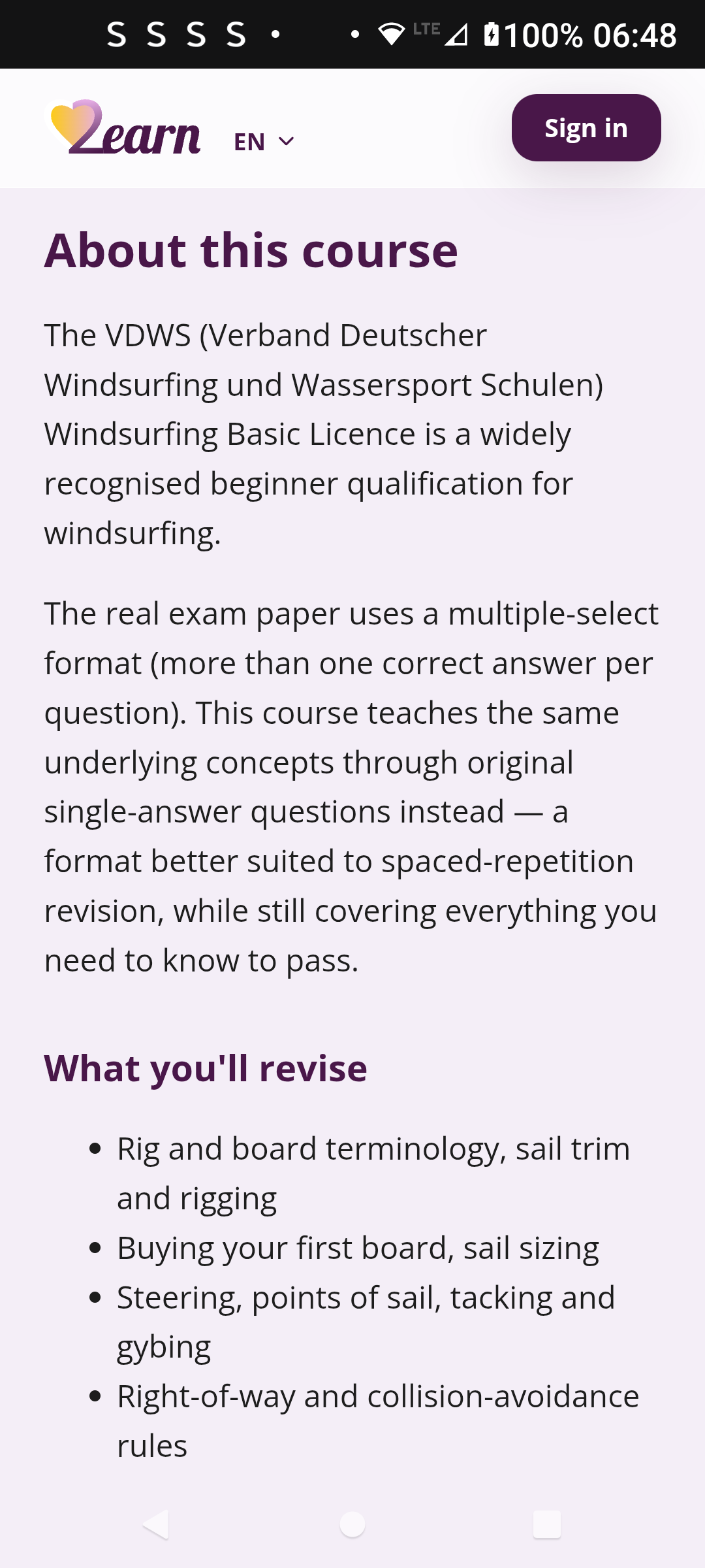
Each course explains upfront how its questions differ from the real exam format, so there's no surprise about what studying here actually prepares you for.
Background
Love2Learn runs a plain Leitner spaced-repetition system: five boxes, a fixed review interval per box, correct answers move a question up a box and wrong answers send it straight back to box one for immediate resurfacing. I deliberately chose Leitner over the more sophisticated SM-2 algorithm that Anki-style apps use for this first version, because SM-2's dynamic ease-factor scheduling is meaningfully harder to build correctly and wasn't needed to hit my partner's exam deadline. The Firestore schema still leaves room to add SM-2's extra fields later as an additive migration, so the simpler v1 doesn't box out the more advanced version.
The 300 source questions came from a real exam PDF, parsed with a Python script and verified question by question before upload, and before doing anything else I checked the licensing: the source is an official German government exam catalogue, which German copyright law explicitly excludes from copyright protection when published in the public interest, and the publisher's own terms confirm it as open data, reusable commercially as long as the content stays unchanged and the source is credited. I built the whole thing on the same Vite, React and Firebase stack I already use for Ticklists, which meant reusing infrastructure knowledge rather than learning a new stack, and I ported Ticklists' glassmorphism visual system in as independent copied files rather than a shared dependency, so a future redesign of either app can never accidentally break the other.
Competitive landscape
Spaced-repetition study apps are a genuinely crowded category, not an empty market. Anki is free, open-source and deeply entrenched, especially in medical and language study. Quizlet has huge brand recognition with students and its own spaced-repetition-style mode. Brainscape is the closest match to what I'm building, spaced repetition plus a marketplace of pre-made decks including exam-prep content on a subscription, which is genuinely useful proof that people already pay for exactly this kind of product. Trying to out-flashcard any of them head-on would be a losing fight. My actual strategy is to win one specific, narrow exam at a time instead of competing as a general study app: being the best tool for one real national licence exam is a far smaller fight than being better than Anki, and personalising the app around the exact exam and the person sitting it is a genuine differentiator none of the big generalist players have any reason to build.
Who it's for
- People preparing for a specific licensed or certified exam who want a tool built around their exact content, not a blank deck they have to fill in themselves
- My partner, revising for Germany's Sportbootführerschein sailing licence, the first real user of the app
- Windsurfing licence candidates, the second course now live on the same platform
- Anyone else with a defined, structured question bank to learn, once the upload-your-own-content feature ships
Design Process
Reusing Ticklists' visual system without coupling the two apps
Rather than designing a new visual language from scratch, I ported Ticklists' frosted-glass, sea-and-wave design system into Love2Learn, colour tokens, the blur technique, the background-photo treatment, since it suited a sailing exam app just as well as a shopping list. I copied the relevant CSS and images across as independent files rather than having Love2Learn read from Ticklists' codebase at build or run time, so a later redesign of one app can never silently change the other, and I can safely experiment on either without any risk of breaking Ticklists.
Replacing internal jargon with plain language
The Leitner system's five boxes are an internal implementation detail, not something a real user should have to understand, so the dashboard shows plain-language stage names and the actual review interval, New, Learning, Improving, Strong, Mastered, instead of exposing "Box 3" to my partner.
Personalisation as the real differentiator
None of the big incumbents let a user upload their own photos from the real activity they're studying for, and it's a genuine, low-cost emotional hook a broad platform has no reason to build. The plan is to let a user upload up to five of their own photos, my partner's actual sailing-course photos, for instance, and have the app rotate one in as the backdrop each session instead of a stock sea photo. It's roadmapped, not built yet, but it's the differentiator I'm designing the rest of the product to support.
Why dark purple and gold
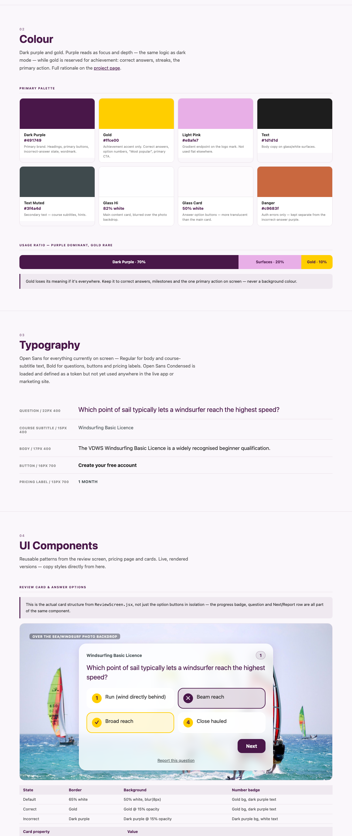
I picked dark purple and gold deliberately rather than carrying Ticklists' teal across, because the two colours do real psychological work for a study app. Dark purple reads as focus and depth, the same reasoning behind dark mode generally, a darker background lowers glare and eye strain over a long revision session, and purple itself carries associations with contemplation and academic rigour. Gold does the opposite job entirely, it's the colour of achievement and reward, so I kept it deliberately rare, reserved for streaks, milestones and the primary action button rather than spread everywhere, which is exactly what would dilute what it signals. Together they read as premium and considered rather than another generic teal study app, calm and dark where you're meant to be thinking, with a clear flash of gold exactly where you've earned it.
Brand
The full brand, logo, colours and favicon were designed and delivered by me as finished assets, deep purple, bright yellow and a soft light pink, defined as a handful of CSS variables so the entire app, including the logo itself, can be reskinned by changing about six lines of code.