
⬅️ On a desktop or laptop: grab the right edge of your browser window and drag it narrower — watch the boxes reflow as the screen width changes.
Drag your browser narrower to see the blocks reflow ↑
This shows you how content reflows inside a grid from top to bottom and from right to left. Content on the far right gets pushed underneath and to the left when the screen gets slimmer.
How the layout changes at each screen width:
1280px and above (wide desktop):
1 2 3 4 5
Desktop (940–1279px):
1 2 3 4
5
Tablet (640–939px):
1 2 3
4 5
Landscape mobile (480–639px):
1 2
3 4
5
Mobile portrait:
1
2
3
4
5
Notice how box 4 drops down underneath box 1 when moving from desktop to tablet width. The content always reflows right-to-left, top-to-bottom.
Grab your phone and visit artfuly.com/design-resources/responsive-design-explained to see the mobile layout for yourself.
This video shows how a fluid grid reflows from desktop to tablet to mobile — watch from 4 to 6 minutes only.
And here's a great tool to see responsive design in action: Am I Responsive? — it shows how any website looks simultaneously on desktop, laptop, tablet, and phone in one view. Just scroll down to enter the website you want to view (I've used my own folio as the example here).
Hopefully you now have a basic idea of how content reflows for different screen sizes, which will help you think through your designs in Figma.
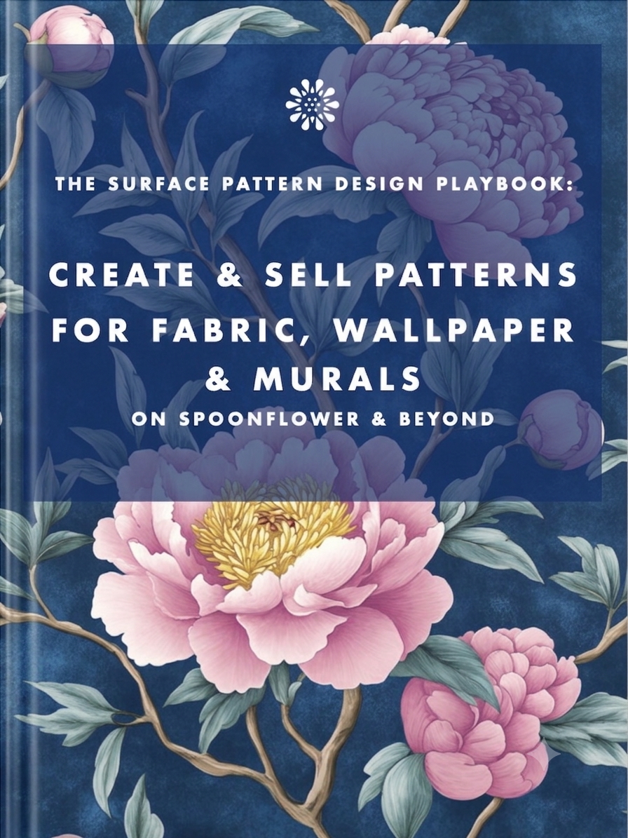
Earn from your design skills
Create & sell patterns for fabric, wallpaper & murals — on Spoonflower & beyond. Client-free, commute-free, creative work you can do from anywhere.
See the book →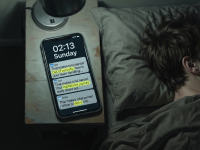
"That makes total sense! Out of curiosity…" are typical sentence snippets in your messages if you're talking to a bot.

A real look at how I use Claude Code, Claude Cowork, Figma and more to design, build and market TickLists, my websites and my Spoonflower patterns, solo.

Job seekers who keep running the old employment playbook are playing a game whose rules have already changed. Here's what's happening in the design job market, and why leverage, not talent, is what separates who's finding traction.
Keep your design skills up to date with videos,
AI workflows, tutorials, ways to earn $$$ and free resources.
See past email newsletters.
Unsubscribe anytime.